Art and science as a single idea
The Deep Holistics brand did not start with a logo. It started with a belief. That the human body is one of the most extraordinary subjects in existence, and that most health brands had decided to make it look boring.
Diagnostic brands looked clinical. Wellness brands looked soft. Neither was right for a platform that was asking people to look at their own biology with curiosity and without fear. We needed a visual language that could hold the rigour of a four-layer biological assessment and still feel like something a person would want to hold, read, and return to.
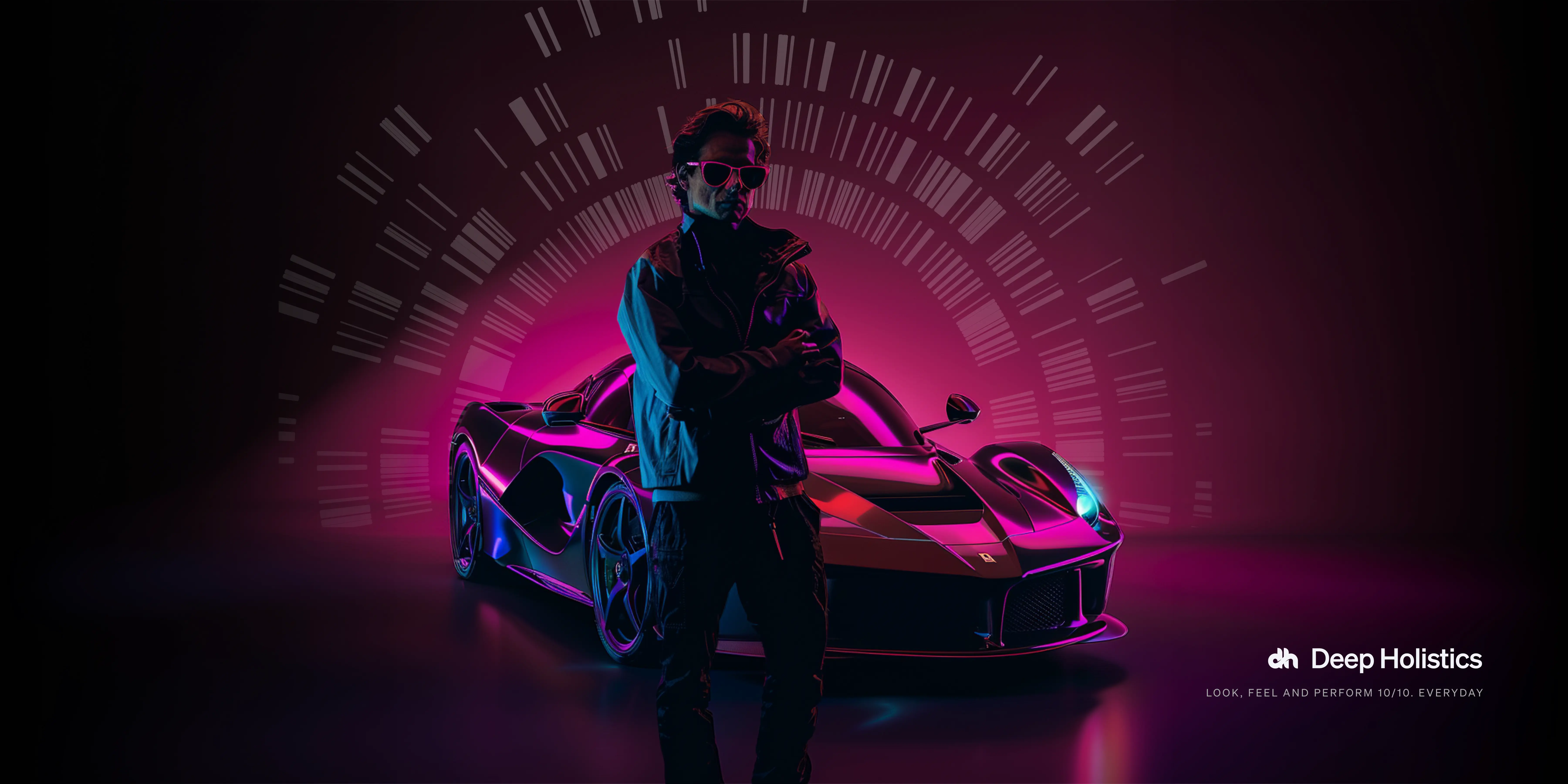
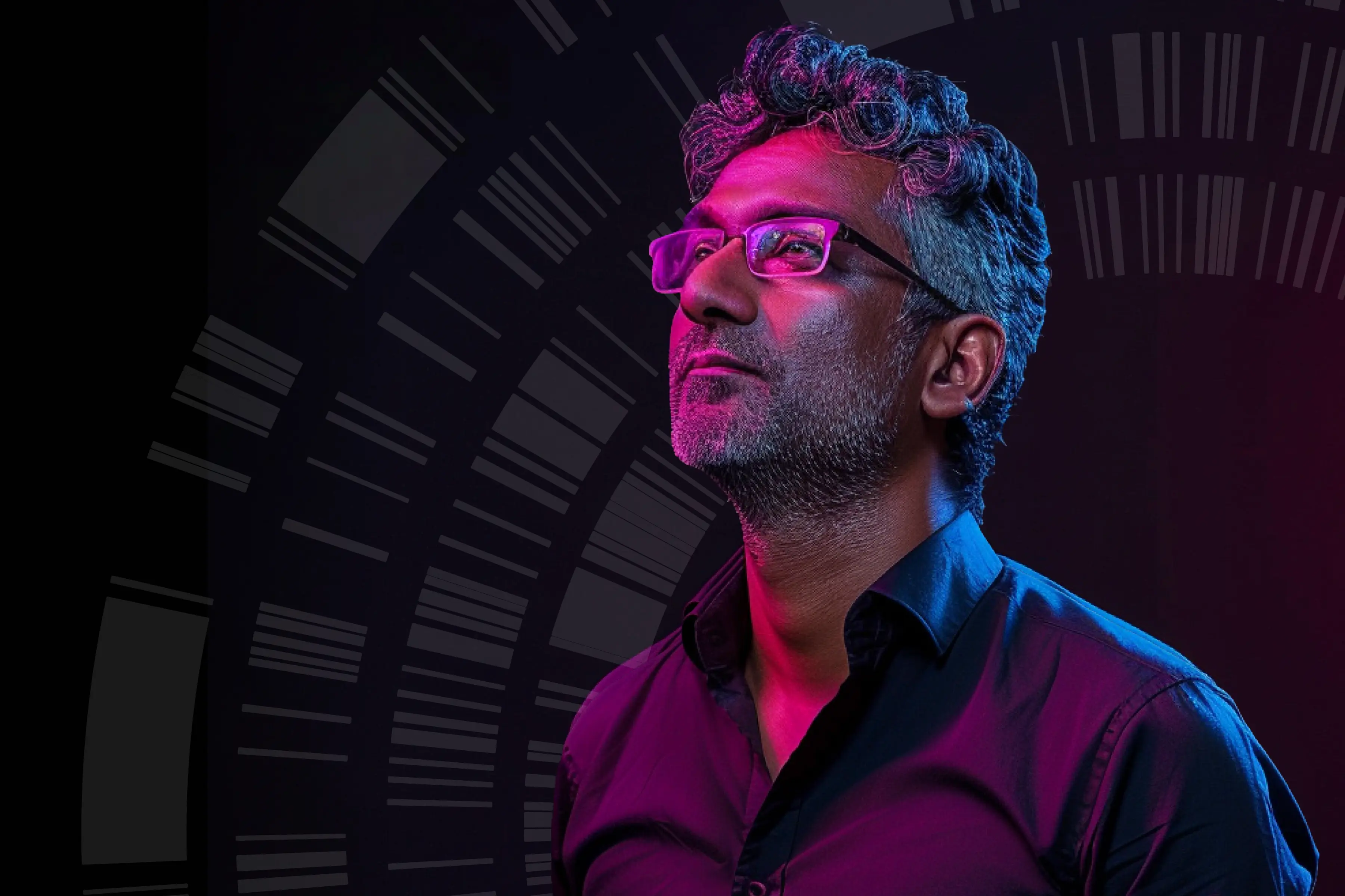
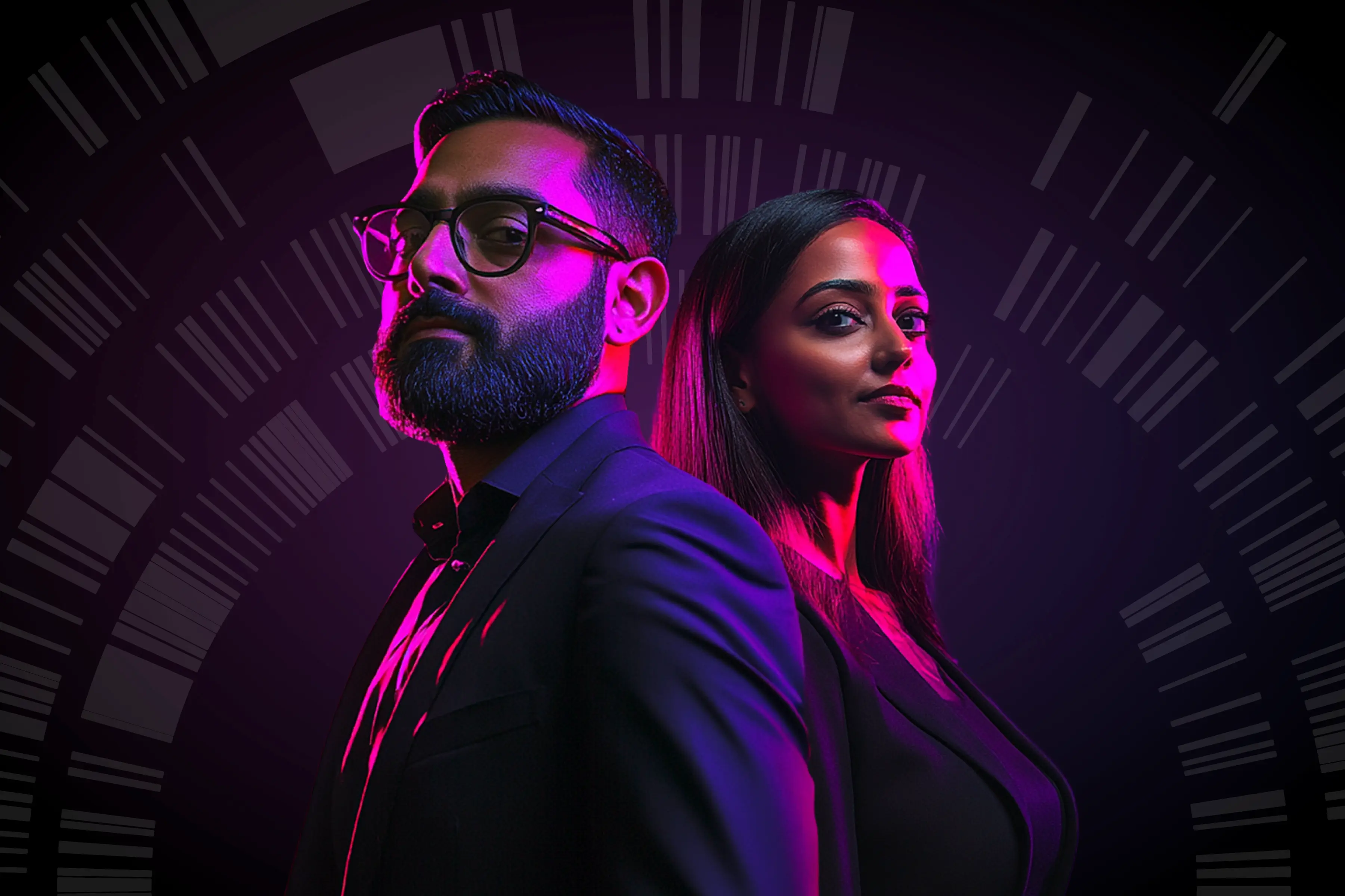
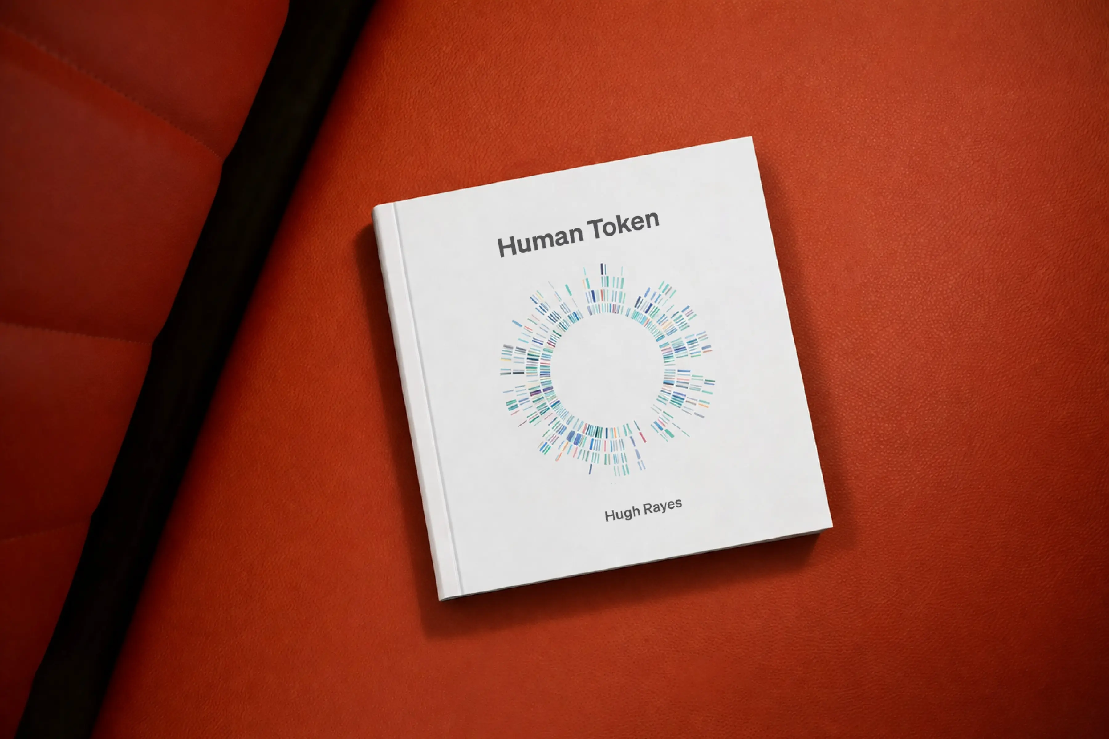
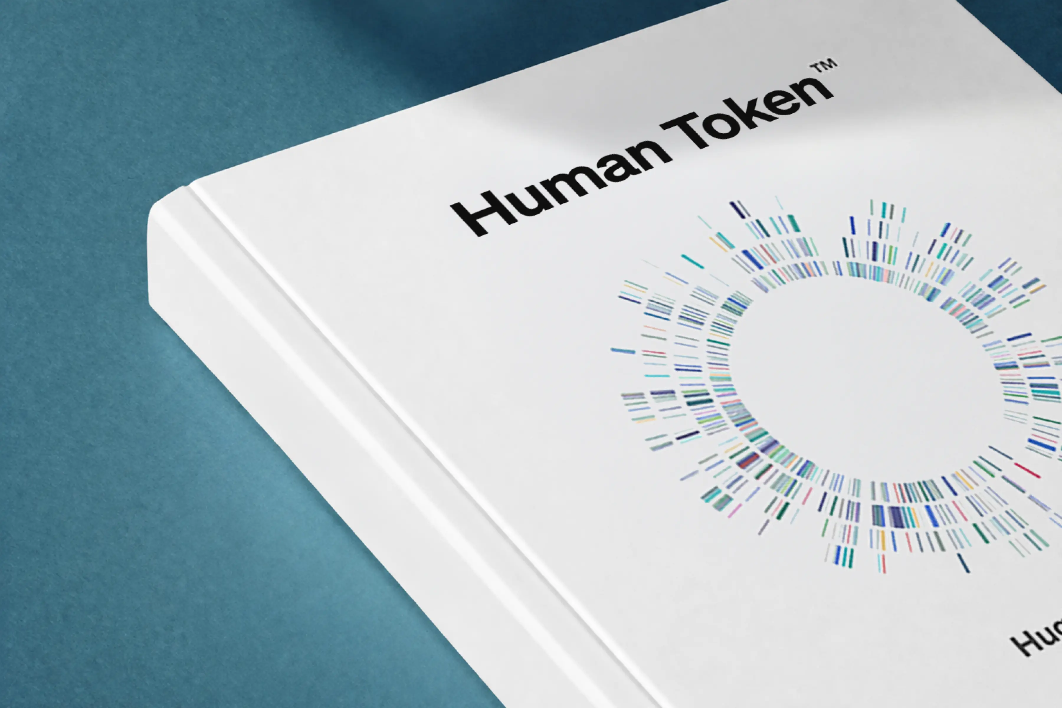
The answer came from a direction I had been drawn to for years. Art does not simplify what it represents. It reveals it without reducing it. The Gene Art at the centre of the identity treats genetic sequencing data as a visual medium. The dispersed glass icons carry the weight of biological complexity with the finish of fine objects. The photography direction uses brand-coloured double-exposure lighting to make the human form feel extraordinary rather than anatomical. Every visual decision was a choice to see biology through an artistic lens grounded in reality. Not clinical, not sci-fi, but genuinely beautiful.
The brand was built in two intensive sprints over two weeks. Discovery to delivery. From stakeholder workshops and positioning analysis to a complete identity system covering mark, wordmark, colour, type, illustration, photography, patterns, and motion. I led the creative direction and coordinated the full process end to end. When the assets started coming together, the moment it clicked was when we saw everything on a canvas at once. It hit the right spot. Ambitious. Scientific. Unmistakably human.
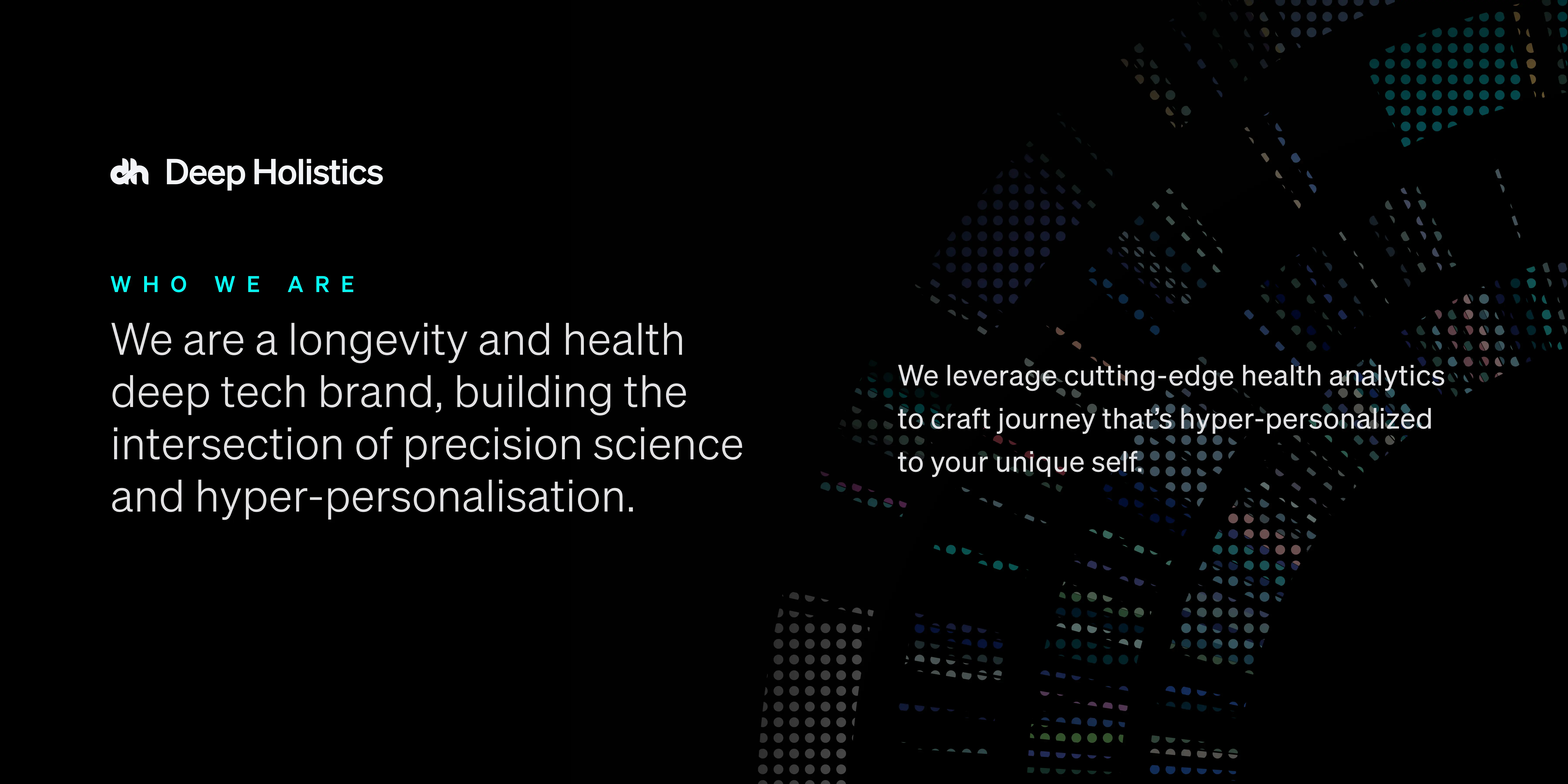
We’re here to empower the change makers.
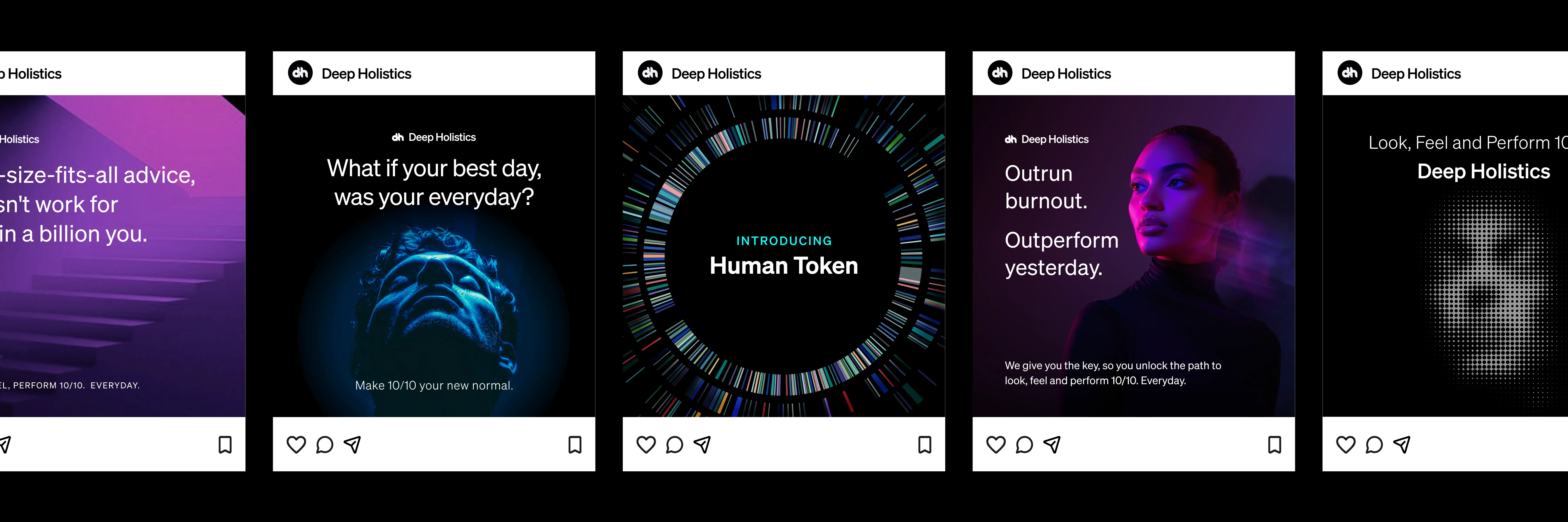
We believe that by empowering the change makers to look, feel, and perform 10/10 everyday, we can create positive change in the world. If you're committed to improving your health, longevity, and performance, you're one of us. A high-performance human optimisation brand expressed through cinematic precision.
A System, Not Just a Symbol
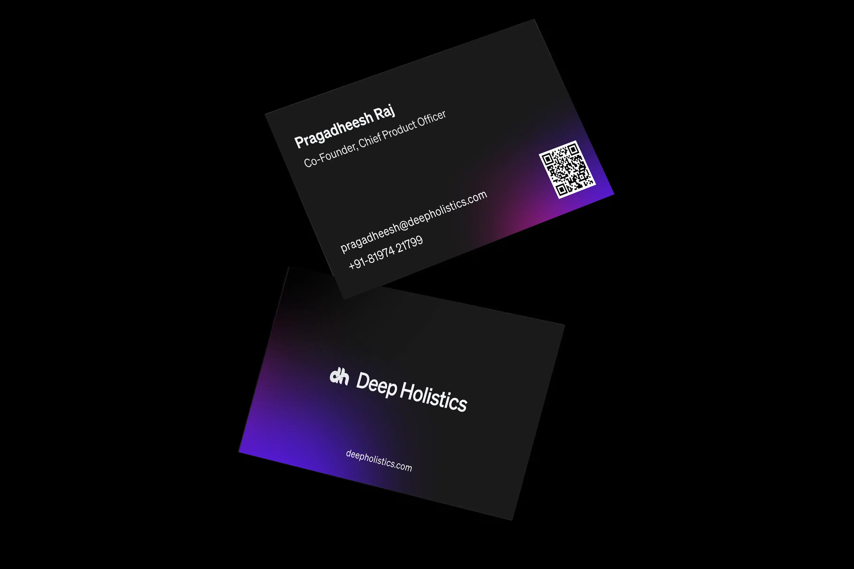
The DH mark is designed as a continuous form, representing the seamless connection between biology, data, and action. Its fluid structure reflects how multiple systems within the body operate as one integrated whole. The geometry is deliberate and controlled, mirroring precision, calibration, and clarity. It is minimal by design, allowing it to adapt across contexts while consistently signalling a premium, modern, and system-driven approach to human performance.
Tech and luxury in the same breath.
The primary palette was built around Electric Blue #4900FF and Red Violet #CA0F88. The combination was chosen because it gave the brand the right balance of technological precision and luxury warmth. Neither colour belonged to healthcare. Both belonged to a brand that was doing something new. The palette is used as blurred ellipses forming soft gradient fields, never as flat fills, never covering more than 40% of the canvas. Colour as atmosphere, not wallpaper.


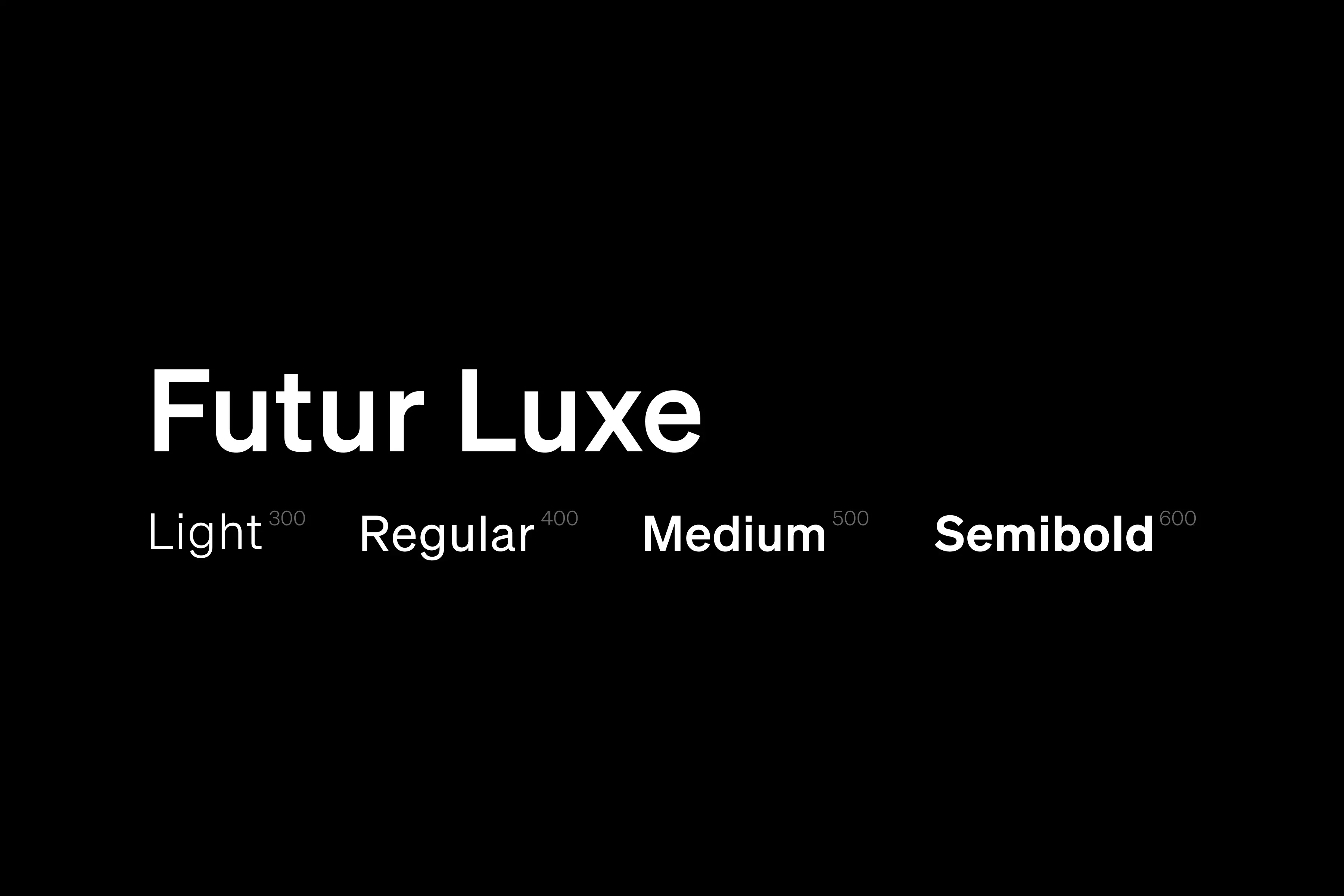
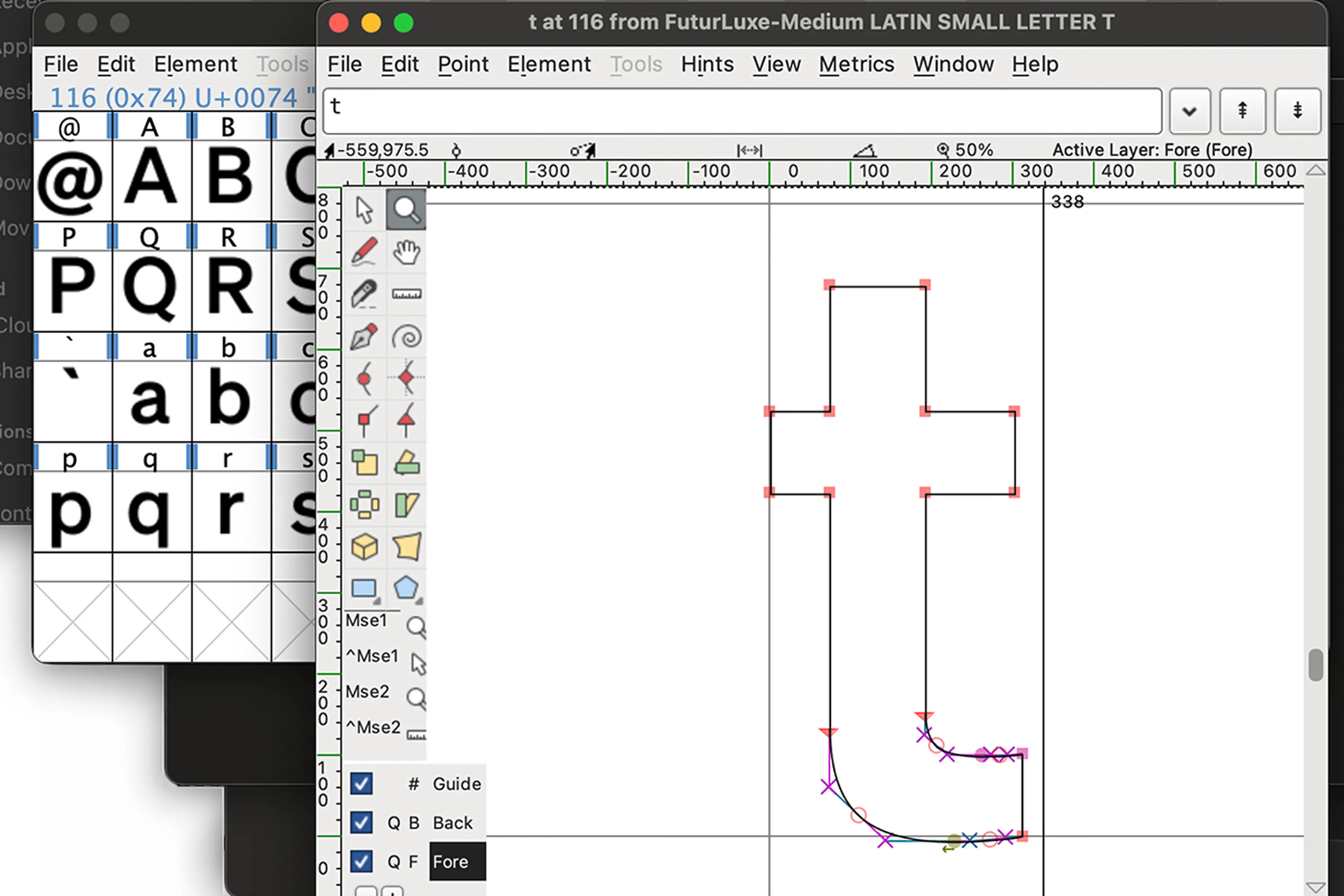
Futur Luxe started as a Grotesk. We took a geometric sans-serif base, inspired by the Swiss design tradition and the clean precision of Helvetica, and modified it to carry a bolder, more tech-first character. The result is a typeface that is uniquely ours. Modern without being sterile. Authoritative without being cold.
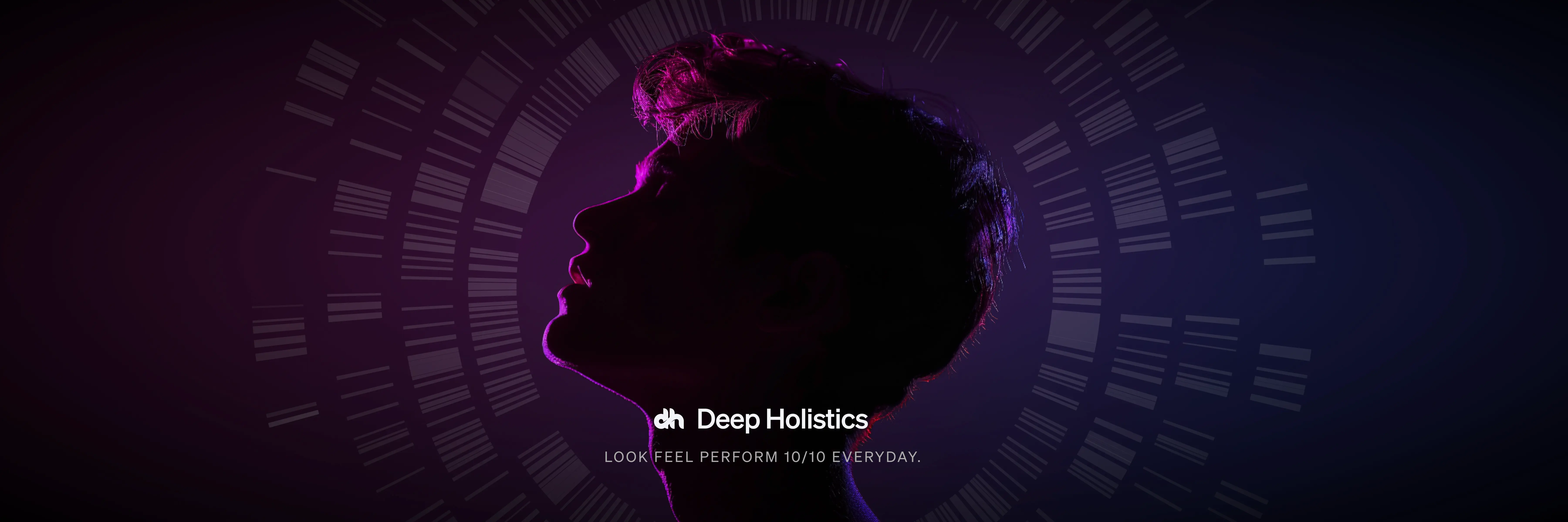
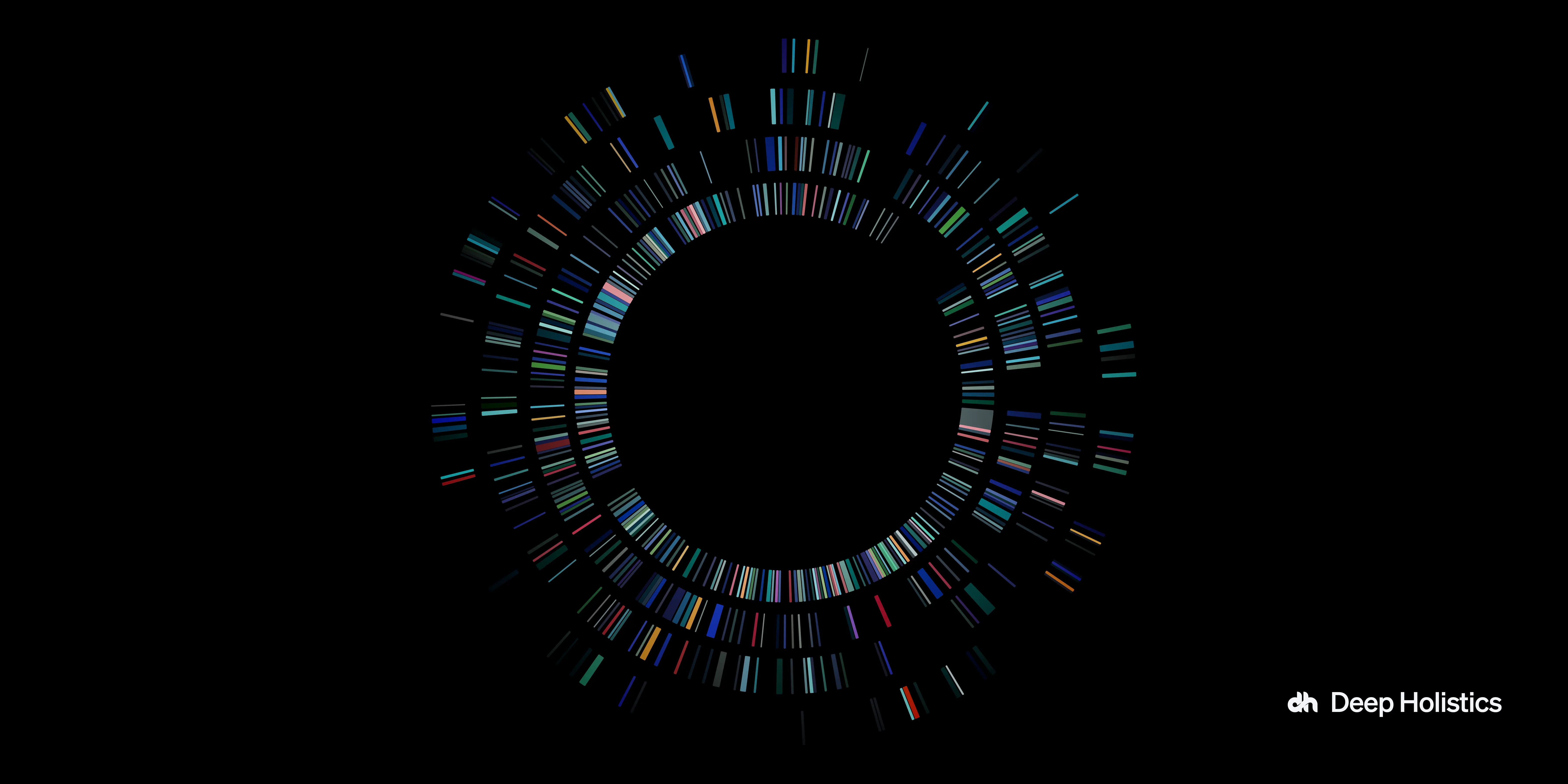
The Gene Art is the soul of the visual identity.
The Gene Art takes genetic sequencing data and renders it as a circular composition of coloured bands. It is scientifically grounded and visually extraordinary. It is always used as the anchoring visual on any canvas, the one element that commands the most attention. It lives at the intersection of data and painting. Every time someone sees it, they are looking at actual biological information made beautiful. That is the brand in a single image: art and science, inseparable.
The Deep Holistics Human Token website was designed as an immersive, experience-first journey rather than a static information page. Through carefully crafted micro-interactions, every scroll, hover, and transition responds to the user, turning complex health data into something intuitive and engaging. These subtle moments of feedback guide attention, build curiosity, and make the experience feel alive, helping users not just understand their data, but feel it. The result is a website that mirrors the philosophy of Human Token itself, where science, design, and technology come together to create clarity through interaction.


No agency. No branding experience. Just the people who understood it most.
At events, people were consistently awestruck by the design. Then completely disbelieving when we told them it was all built in-house. That reaction was the validation. We were a new brand creating a category from scratch. The conventional move would have been to hire an agency. The reason we did not was a conviction I could not let go of: any external team, however talented, would be designing from the outside. We were designing from inside the idea itself.
None of us had formal branding experience. What we had was something rarer. Complete depth of context. Absolute clarity on what the brand was meant to communicate and why. My argument to the stakeholders was simple: design principles remain the same regardless of the medium. And the people most qualified to translate a vision are the ones most vested in it. We convinced them to let us try before committing to an agency. What we made surprised everyone in the room, including us.