Kickash was built to make quitting look cool, sound cool, and feel like a choice you made for yourself, not one made for you by a doctor.
Quitting is not weakness. It is the hardest thing some people will ever do. We decided it should look like it.
Kickash was an Entrepreneur in Residence experiment within Deep Holistics, built as an independent brand with its own identity, personality, and product ecosystem. It was deliberately designed to look like it had nothing to do with its parent company.
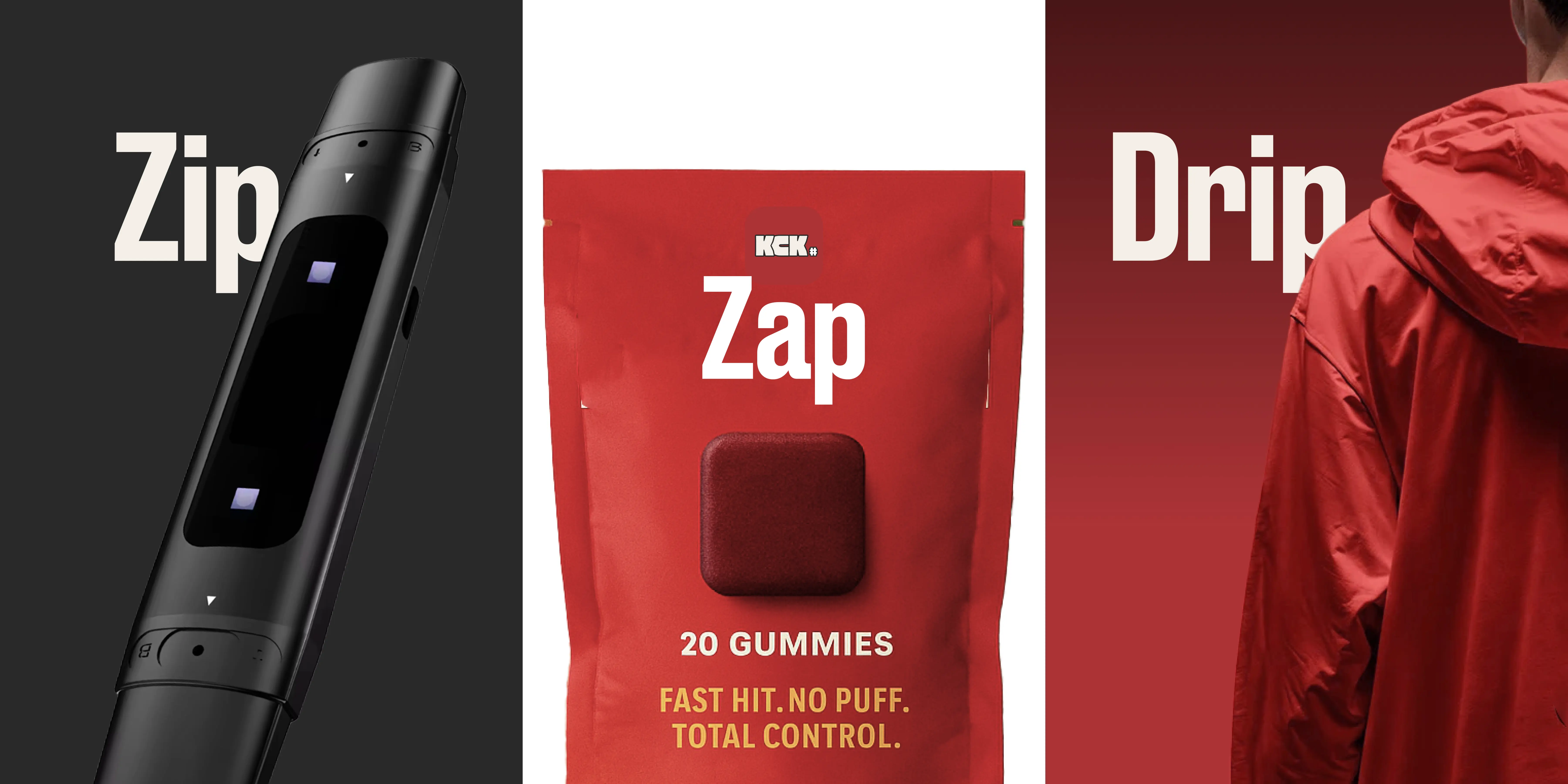
The name said everything. KickASH stood for Kick Alcohol, Smoking and Hate. A brand built for Gen Z. Not for people who had already decided to quit, not for people who had failed before, but for anyone who wanted quitting to feel like a choice they made for themselves, not a prescription handed to them by someone else.
The brand started as an Entrepreneur in Residence experiment within Deep Holistics. The idea was to build a separate ecosystem, a brand that could stand completely on its own with no visible connection to its parent company. Deliberately. The world Kickash was entering, streetwear, youth culture, Gen Z identity, had no patience for corporate health branding. It needed to feel like something that came from the culture, not from a boardroom.
The philosophy was inclusivity in the most specific sense. Not just for the person quitting. For the friend who buys them the Zip. For the partner who wears the Drip. For the group that does the 50 Day Challenge together. Quitting was positioned not as recovery but as a collective flex. Something you did with people, not despite them.
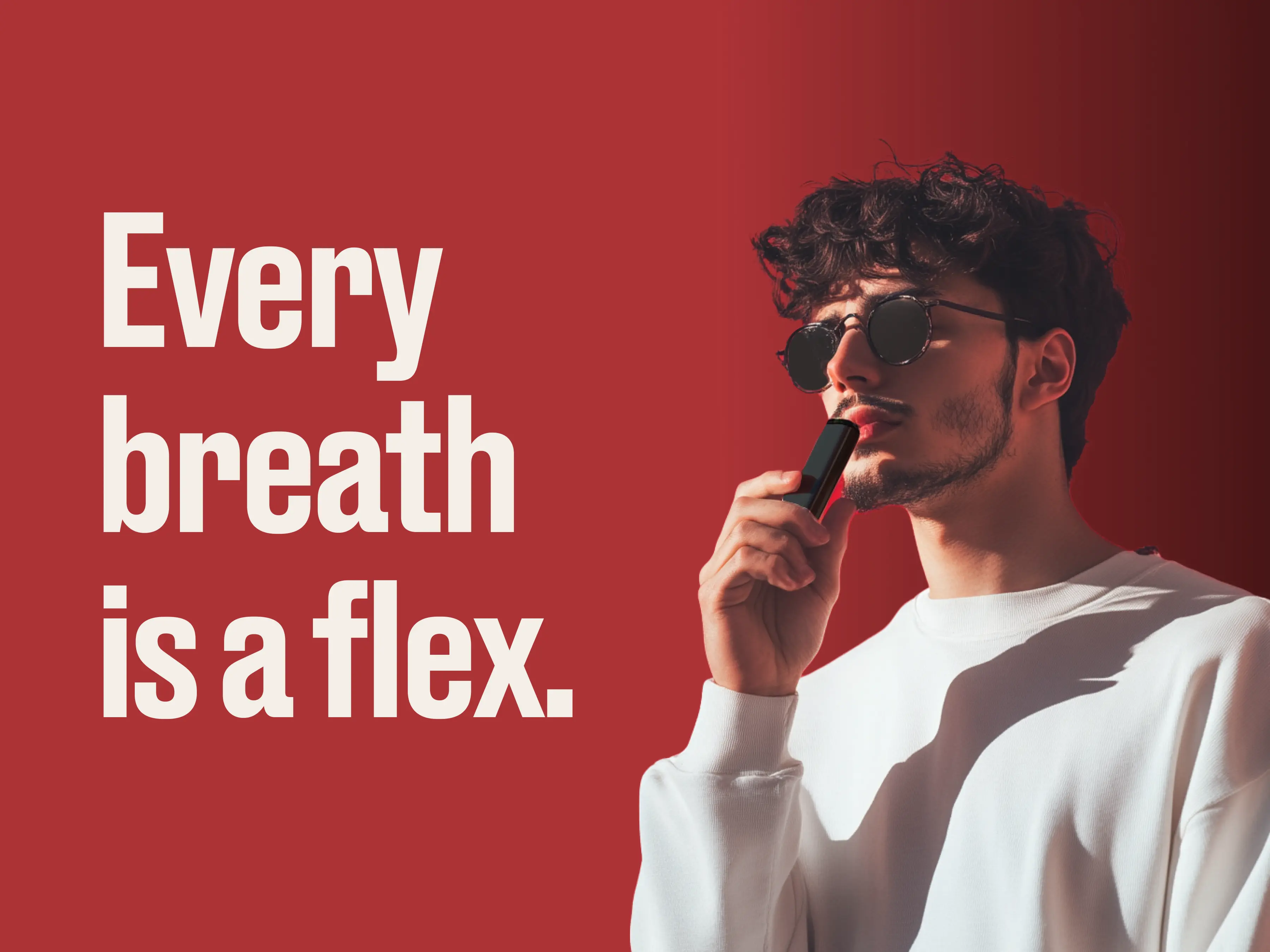
Starting from a single brief, make quitting look and sound cool, I built out the full brand and wrote every line of copy. "Quit like a Badass. Not a patient." was the line that unlocked the rest of the voice.
Every line of brand communication came from one direction: make the person feel powerful, not sick. Health brands talk to patients. Kickash talked to people who had decided they were done being defined by a habit. The copy was written to sound like it came from the same culture as the audience, not from above it. Direct, confident, a little irreverent. "Zip in. Crave out." "Wear the quit." "Every breath is a flex." Each line was designed to work as a standalone statement, the kind you would put on a cap or a hoodie and actually wear.
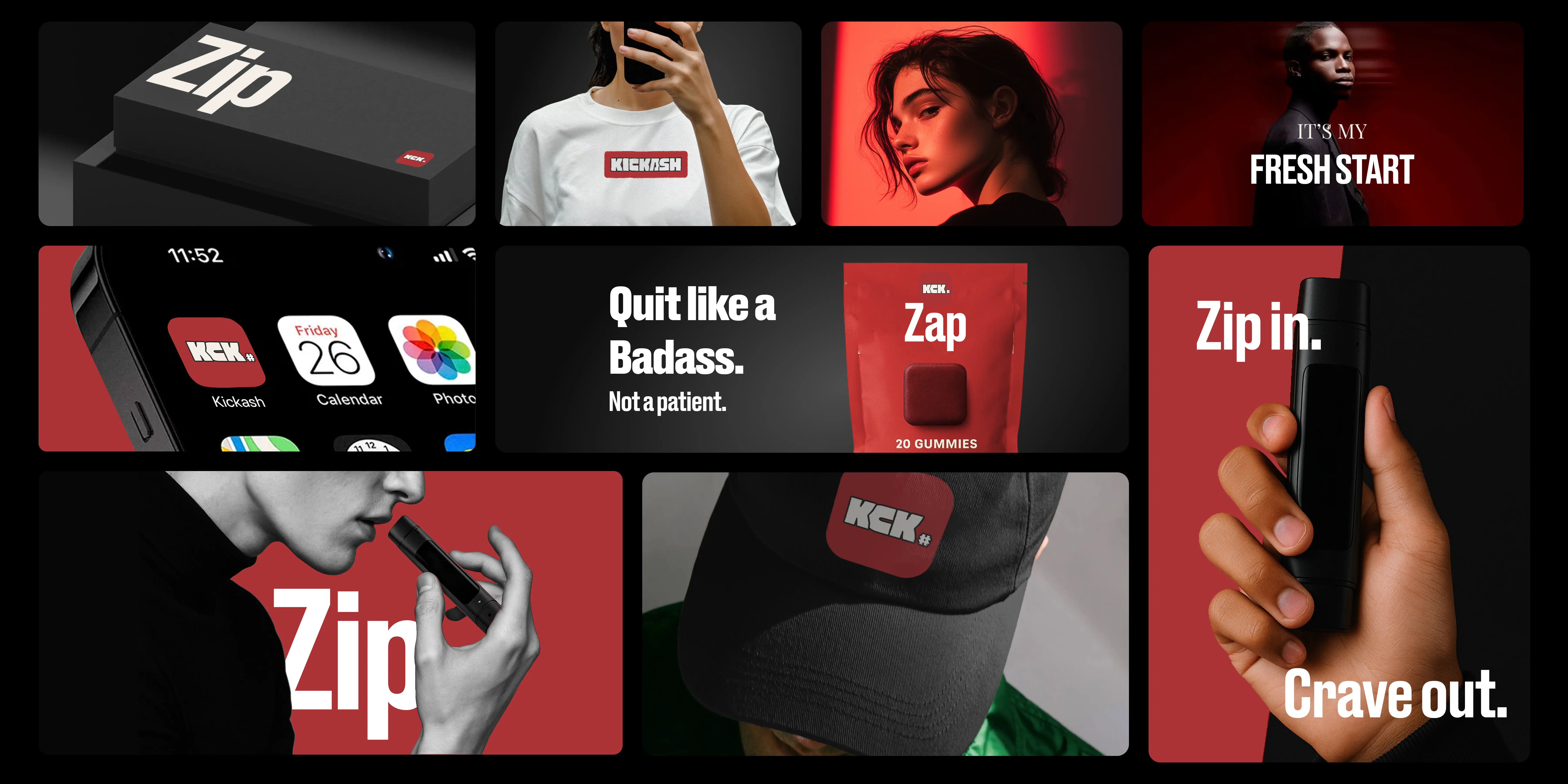
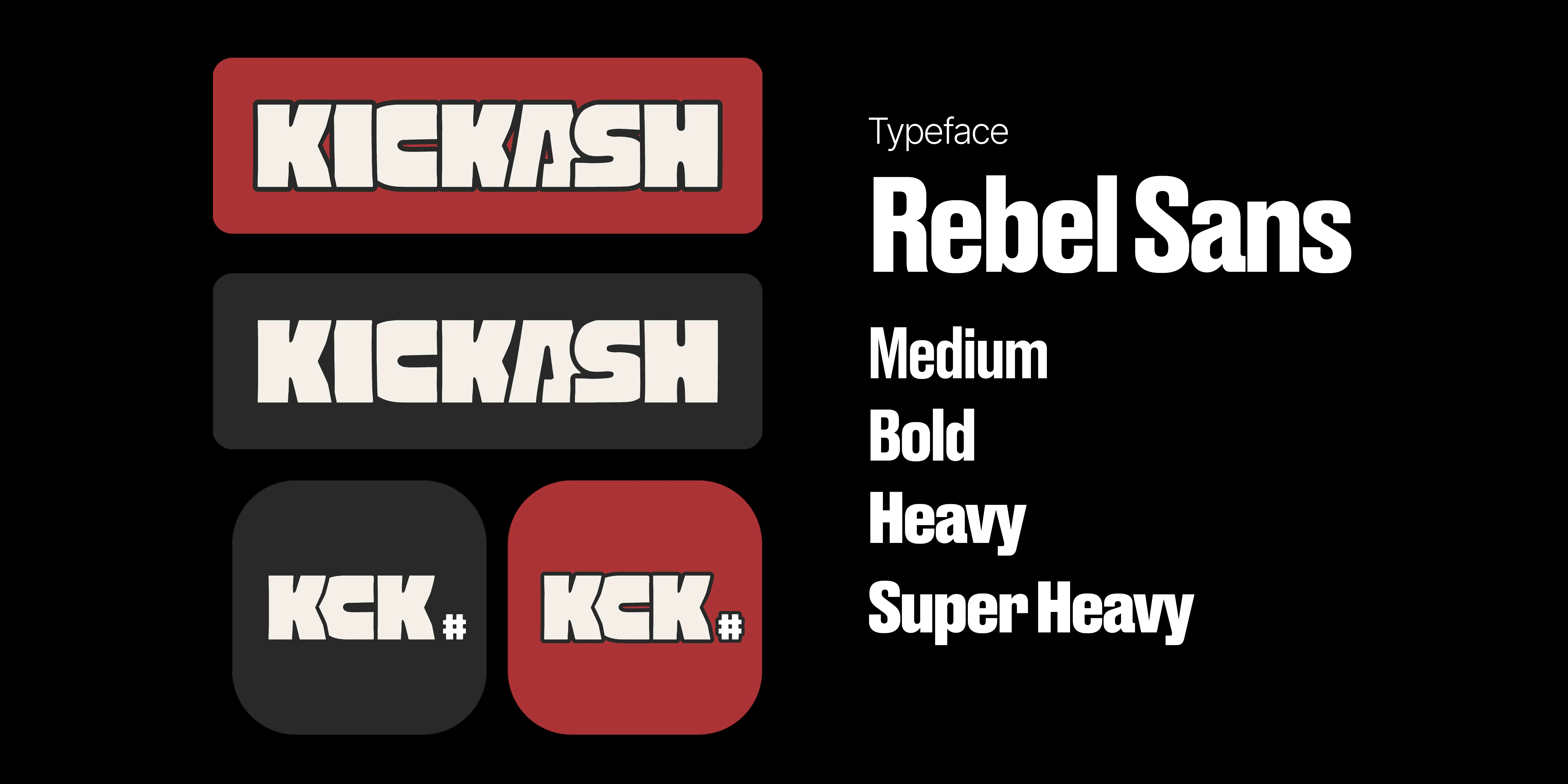
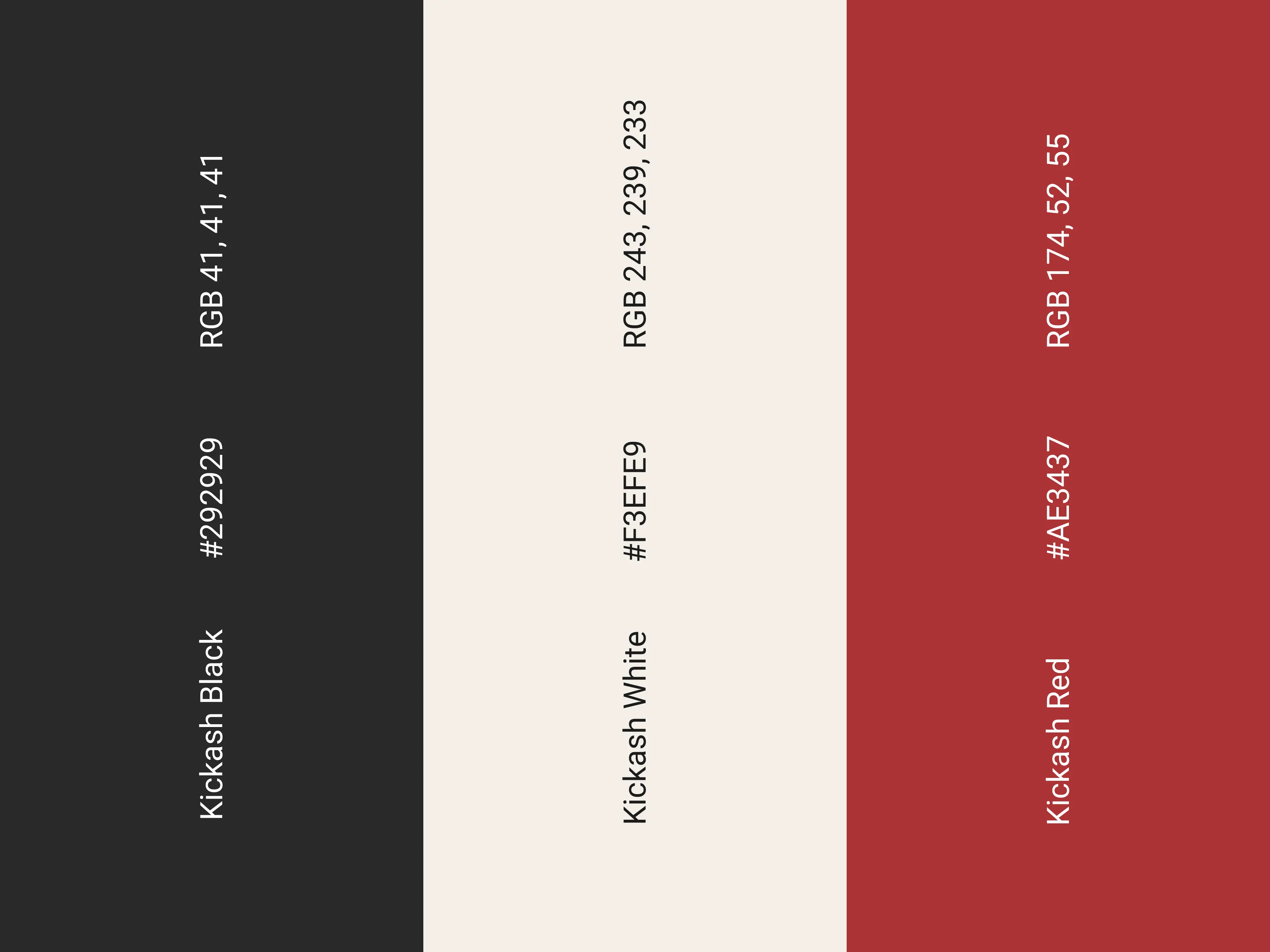
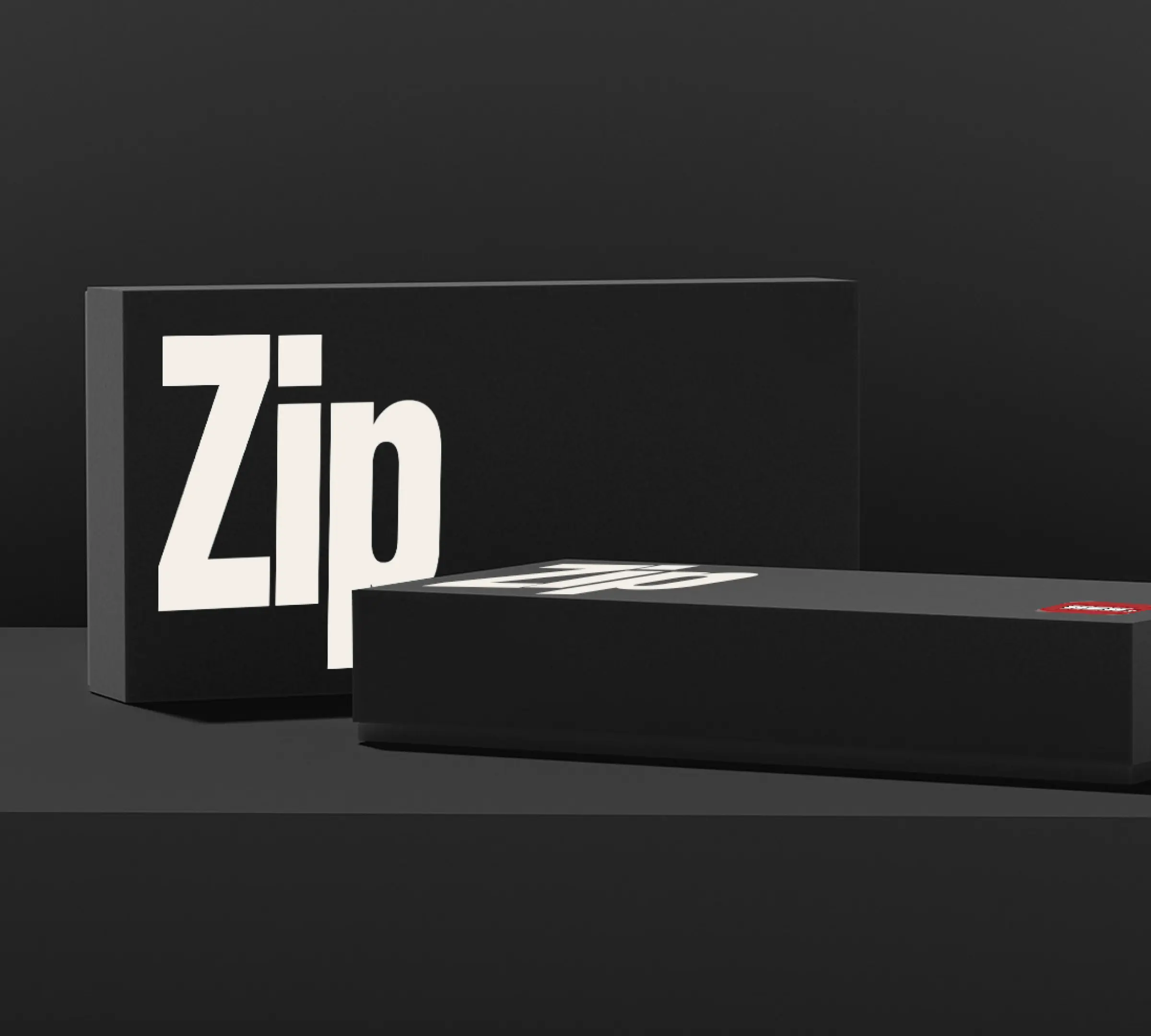
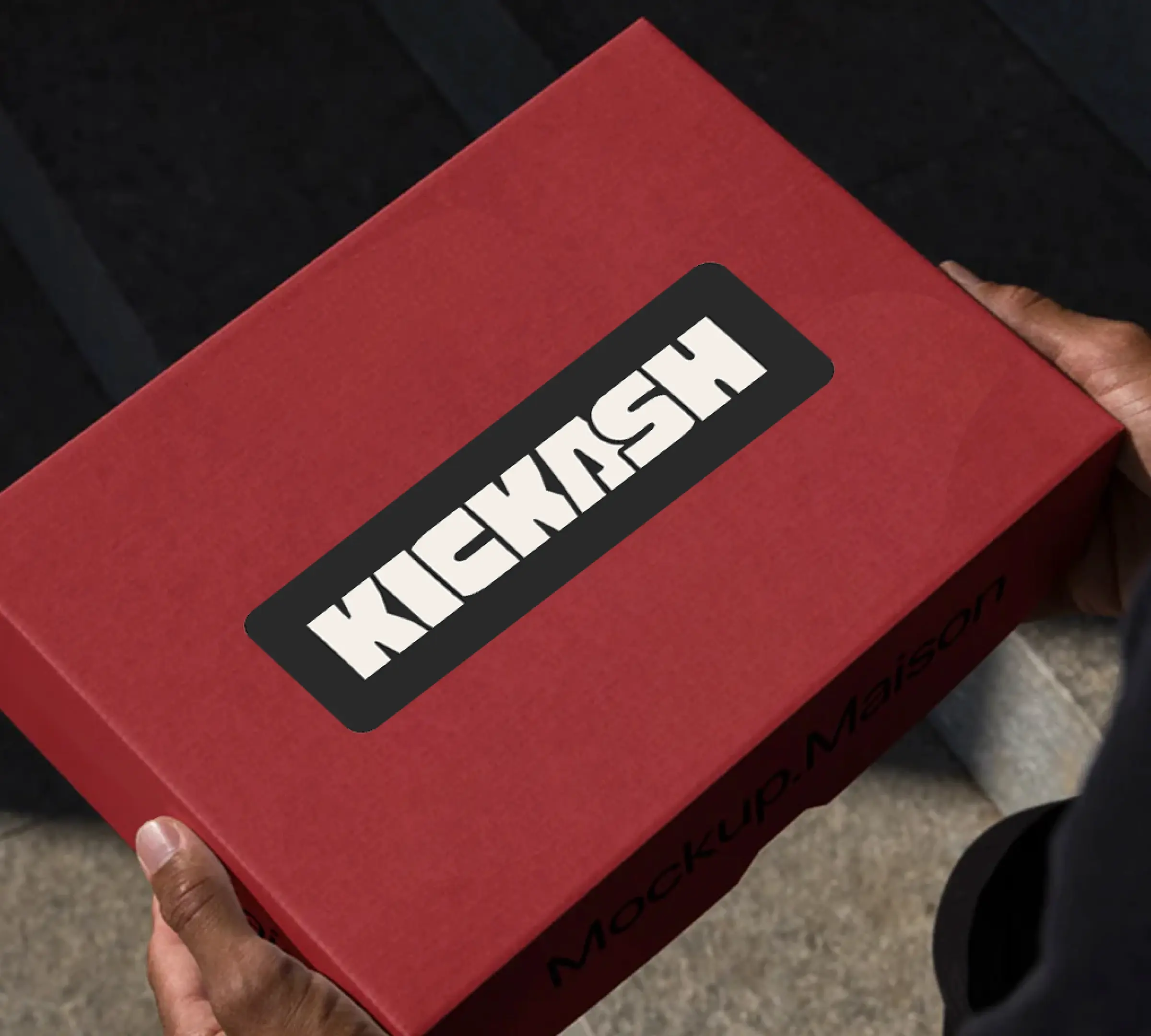
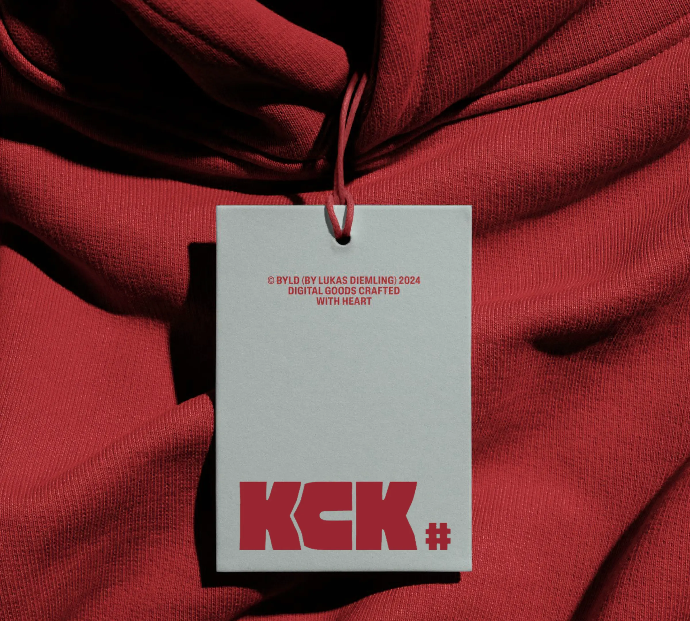
The identity was built to stand out on a shelf, on a screen, and on a body. The palette was deliberately minimal: black, off-white, and a single strong red. No gradients, no complexity. The typography was condensed and heavy, inspired by streetwear and sports branding, the kind of type that takes up space and does not apologise for it. The KCK mark was designed as a badge, the kind you would find on a collab drop or a limited release, not on a health product. That tension was the point. It looked like it belonged in a different world entirely, because it did.
Creative direction, visual identity, product naming, brand communications, packaging, merch, and advertising copy, executed end to end. The result was a brand that stayed consistent across every touchpoint, from product to packaging to culture.
More Case Studies
View all ↗