From product to practice
REM Ritual started from a frustration with how the sleep industry talked about sleep. Clinical supplements. Functional trackers. Products designed to solve a problem you did not fully understand. The category treated sleep as a deficit to correct, not a state to cultivate.
The founding idea was different. Sleep is not an outcome. It is a ritual. The research was consistent: consistent sensory-driven habits in the hours before bed shape the quality of the sleep that follows. A candle, a tea, a particular texture against the skin. These are not luxuries. They are cues. Signals the body learns to associate with the transition into rest.
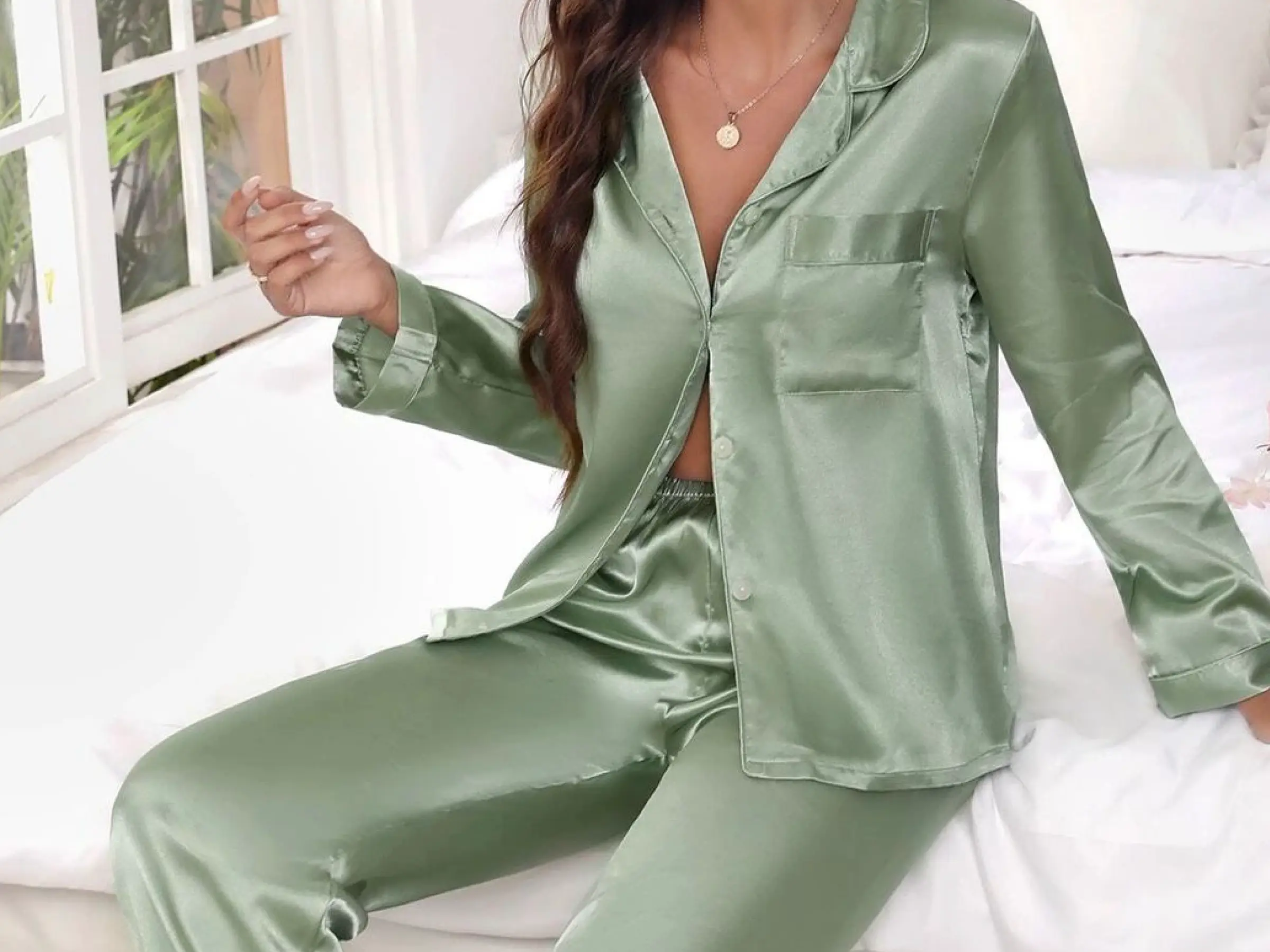
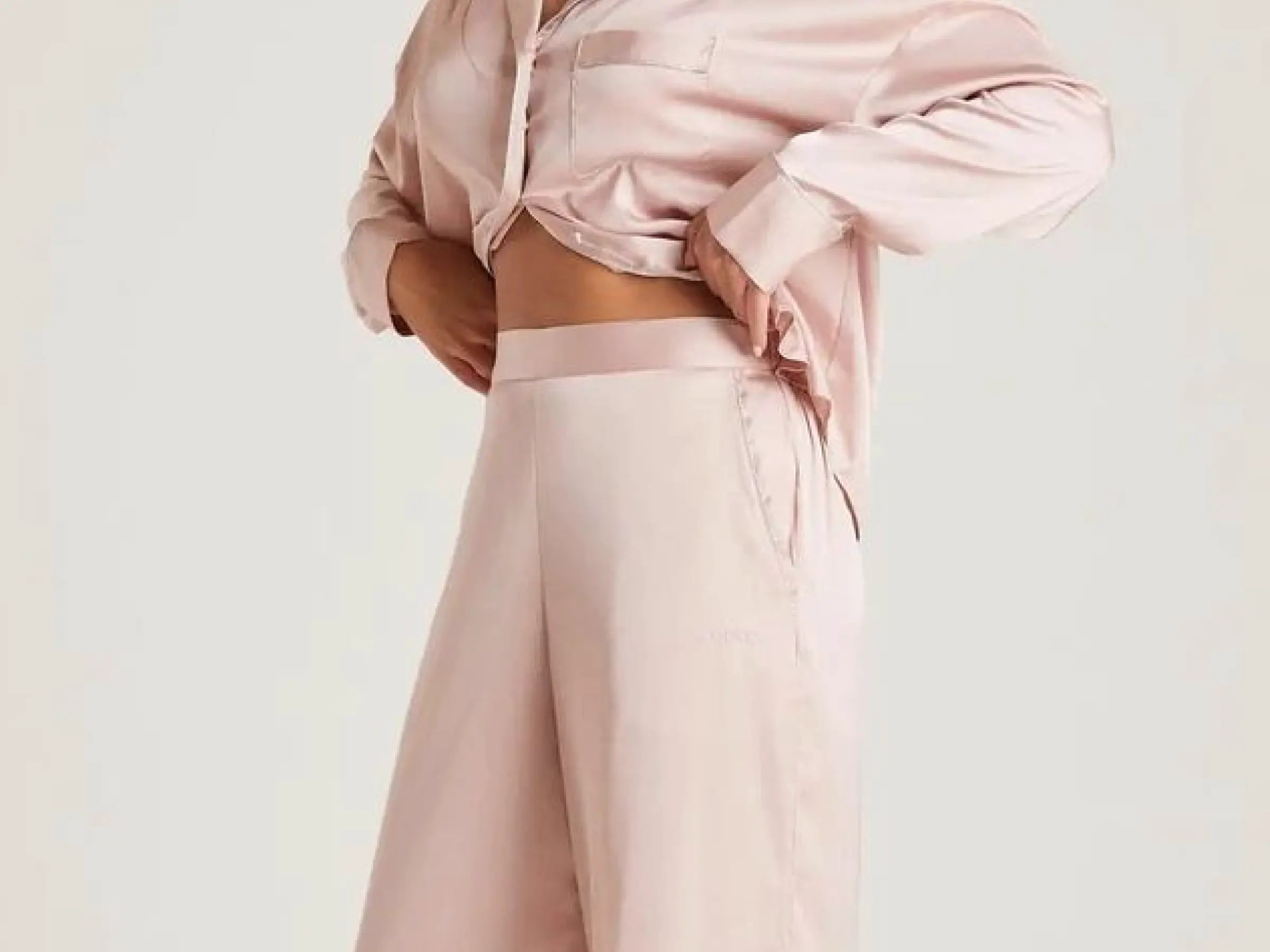
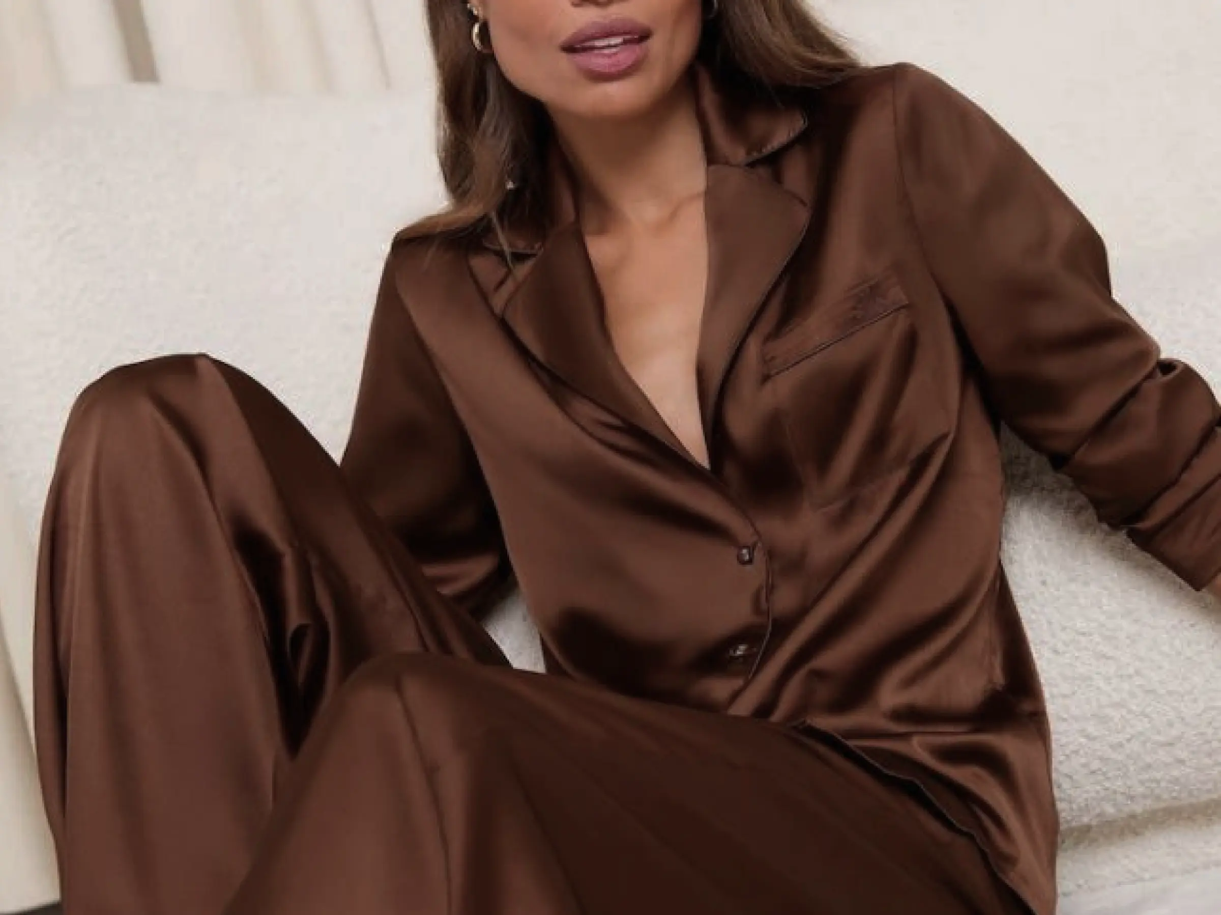
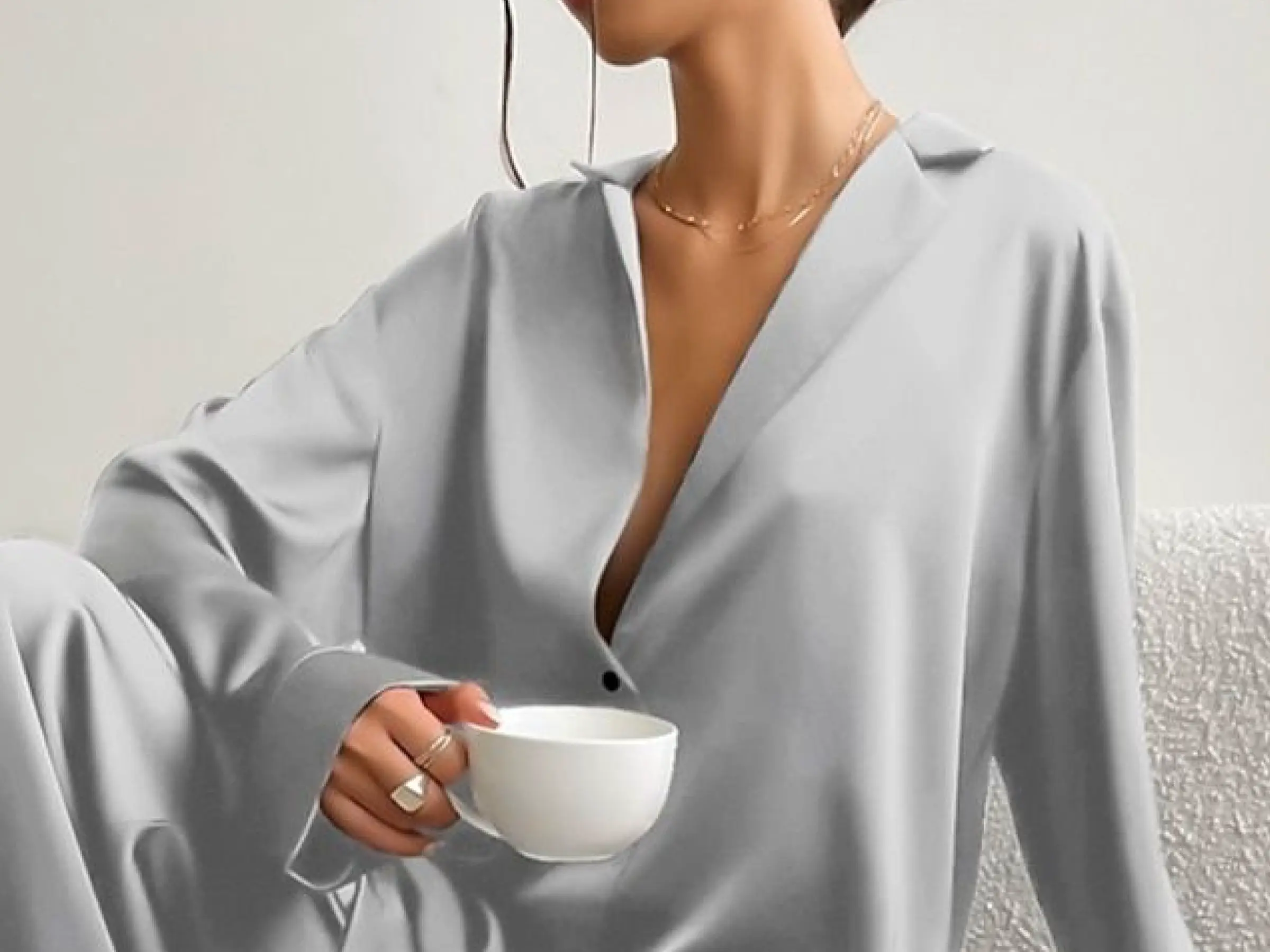
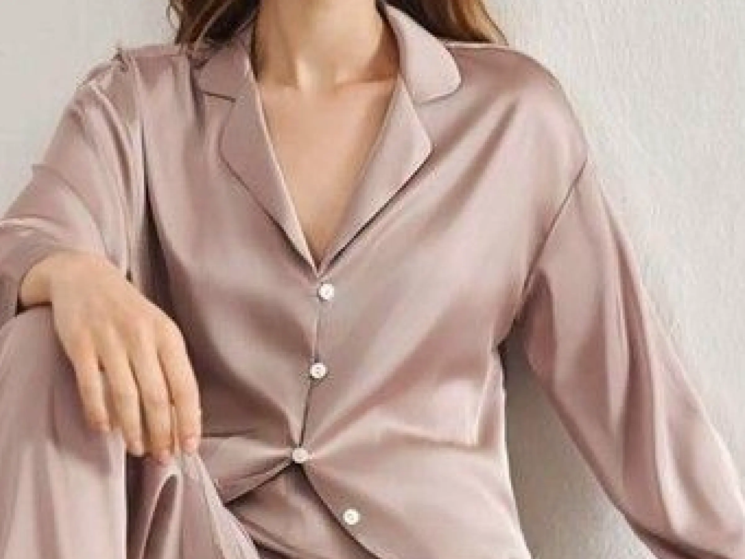
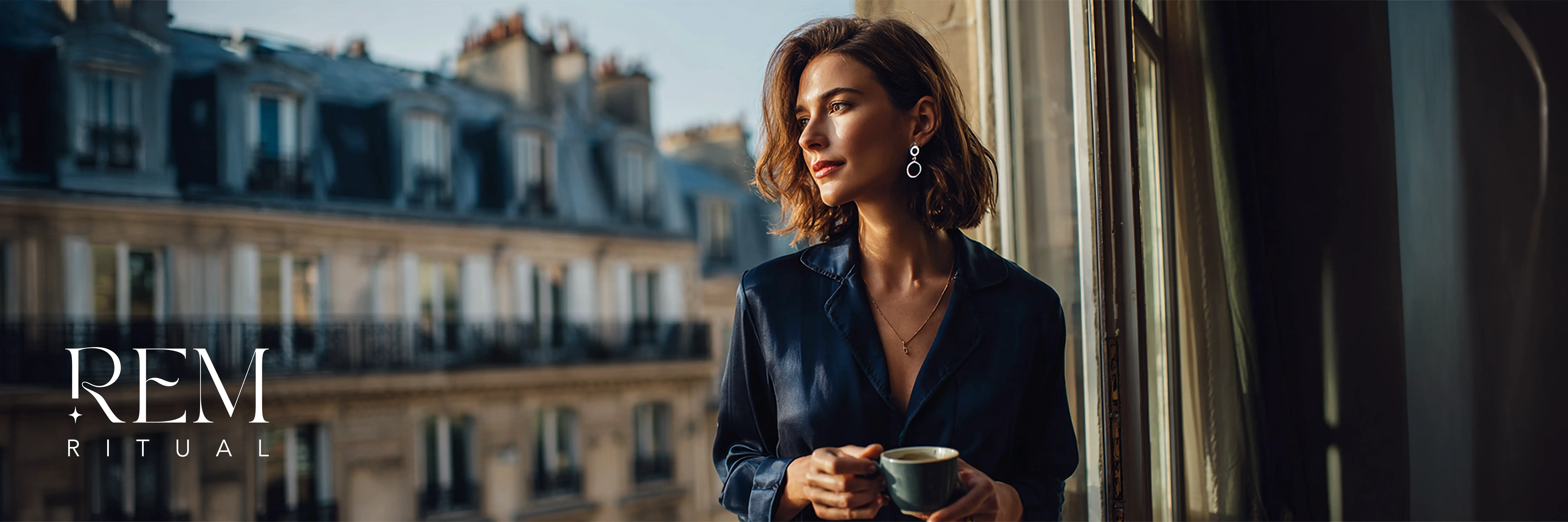
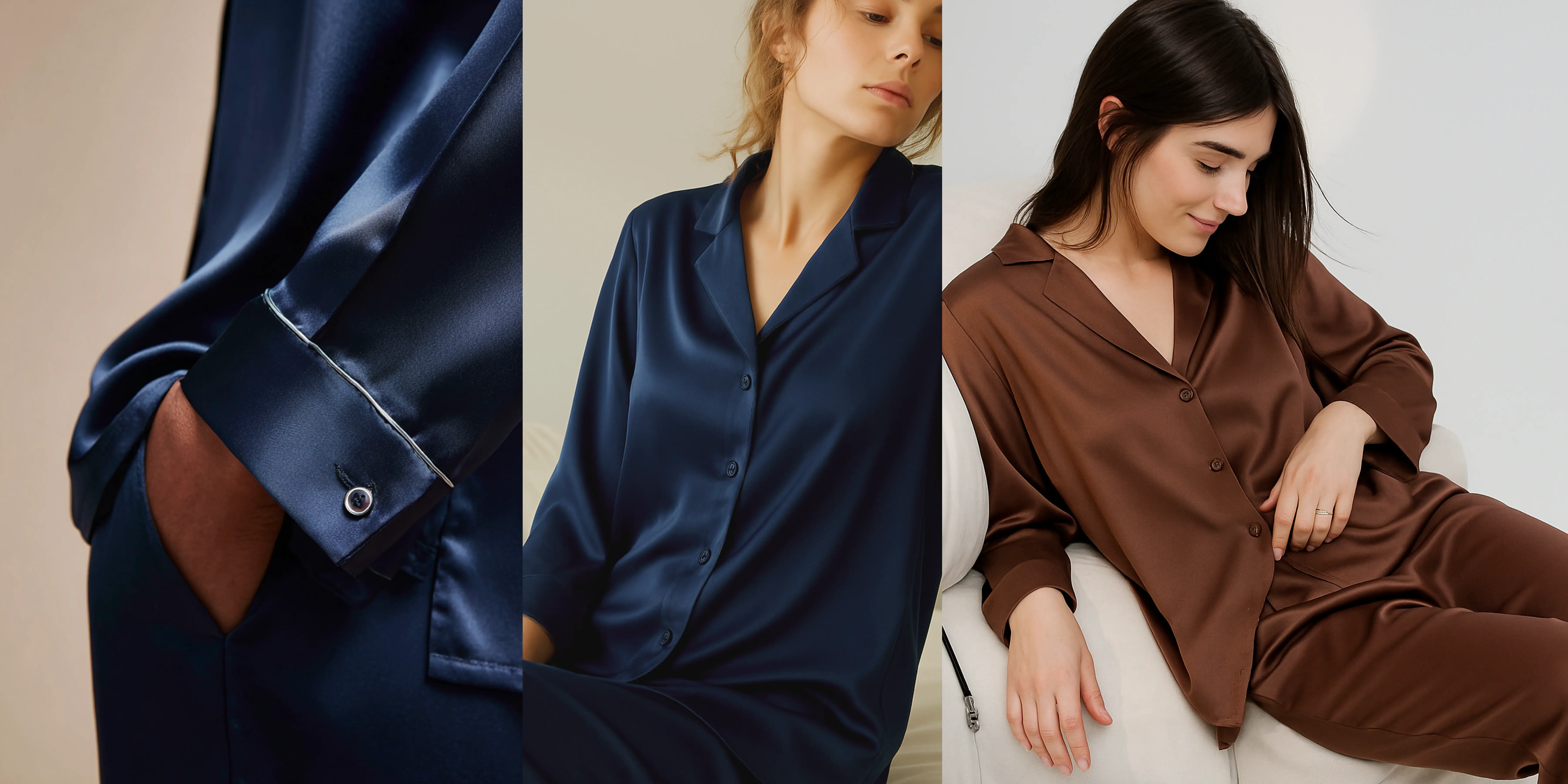
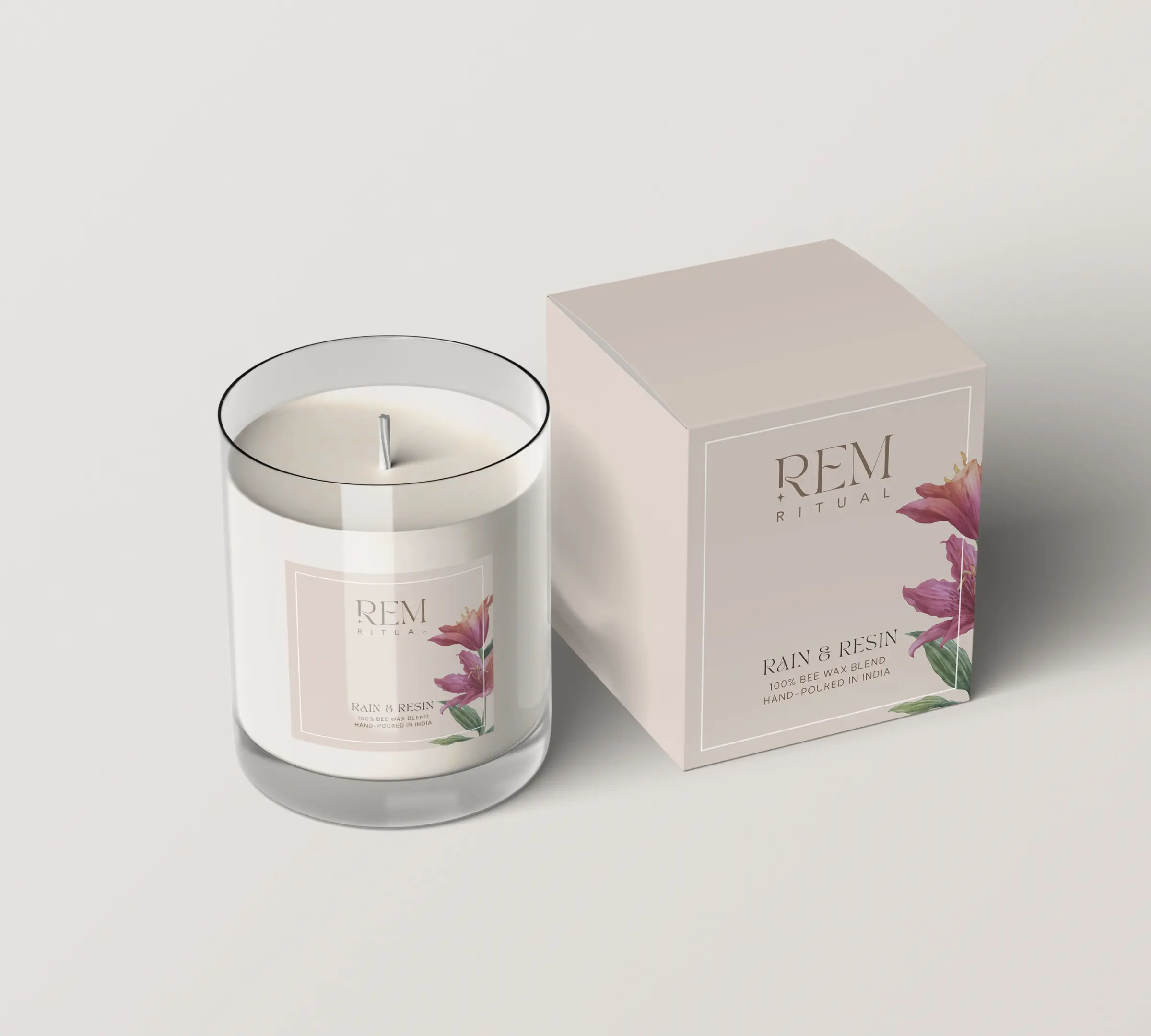
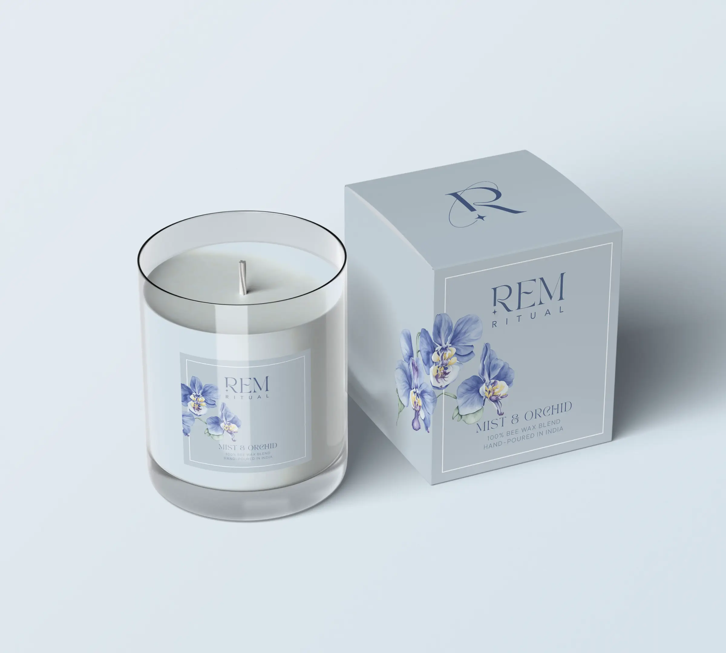
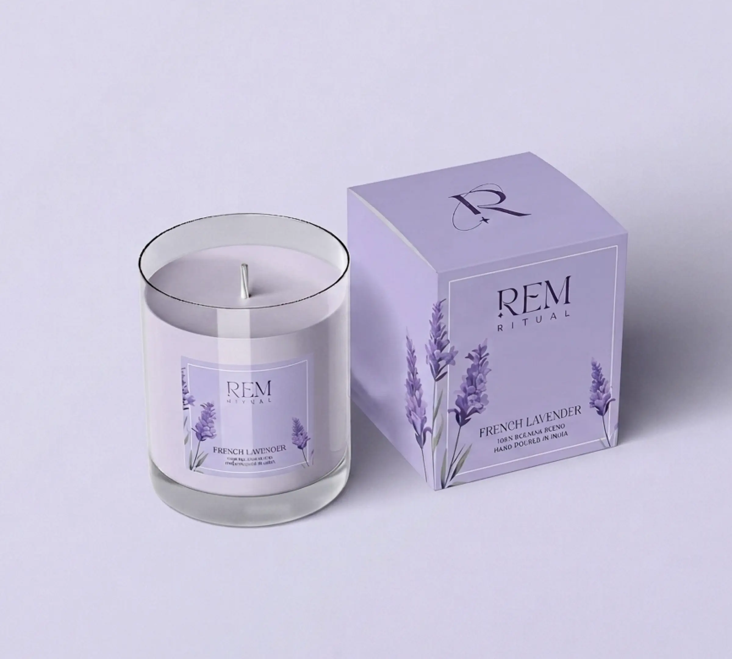
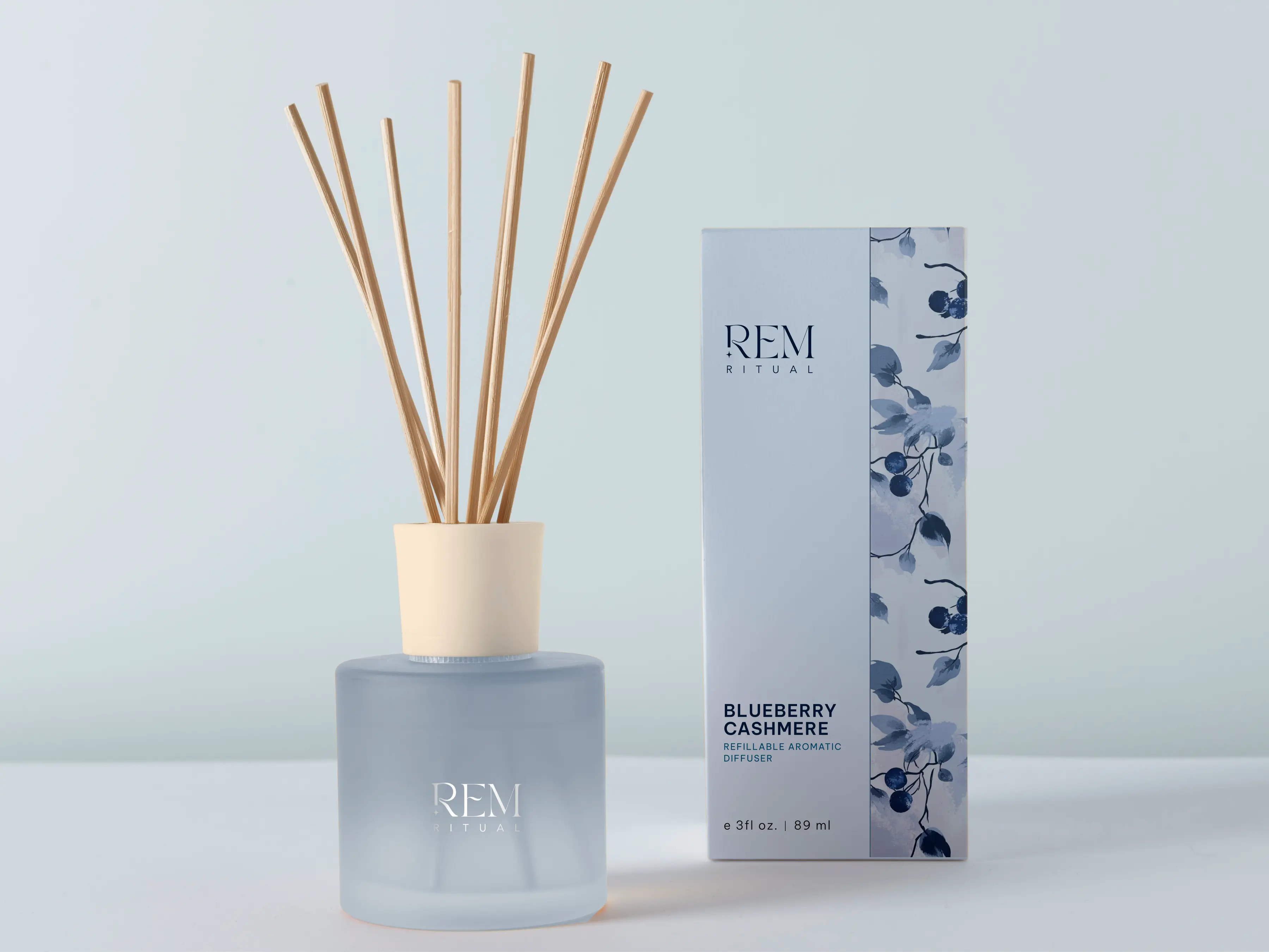
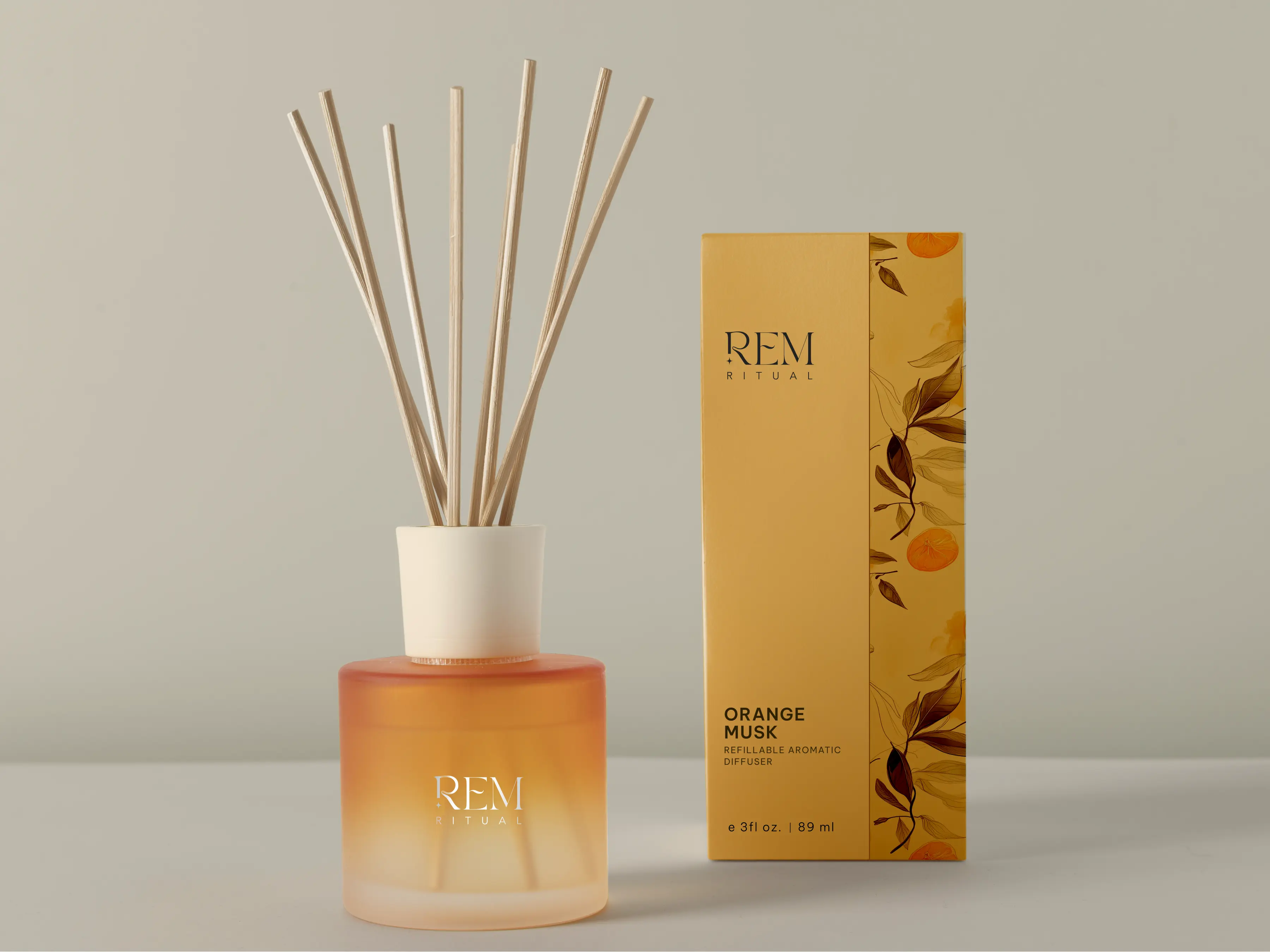
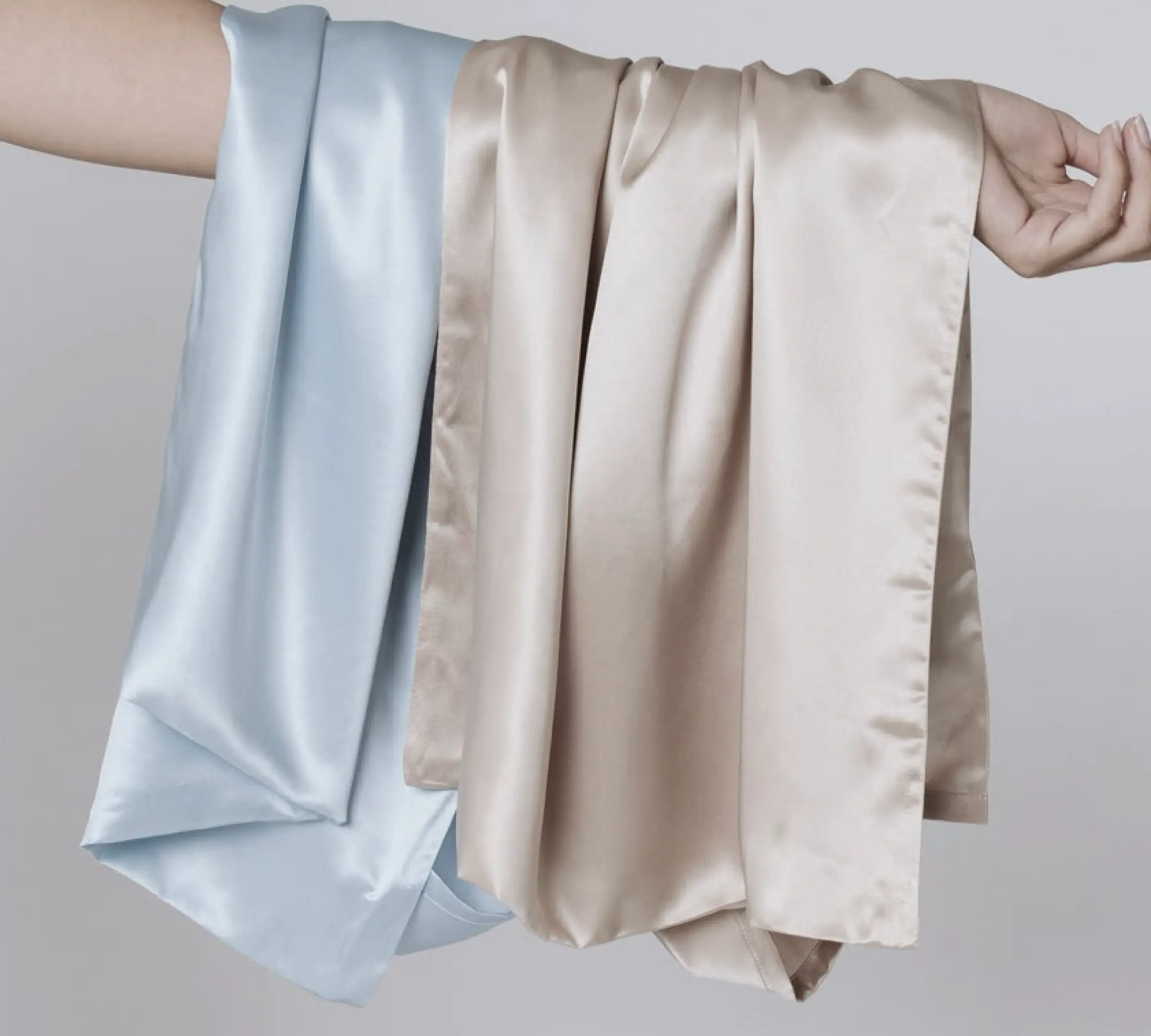
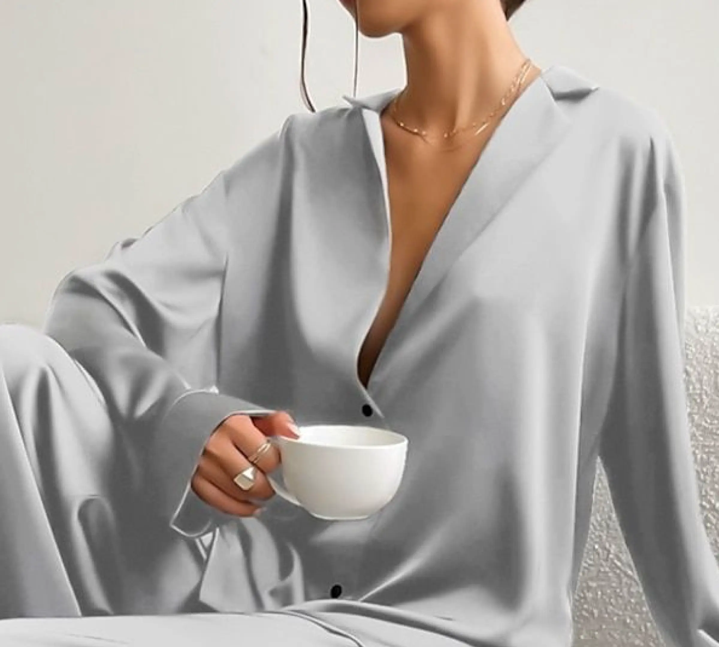
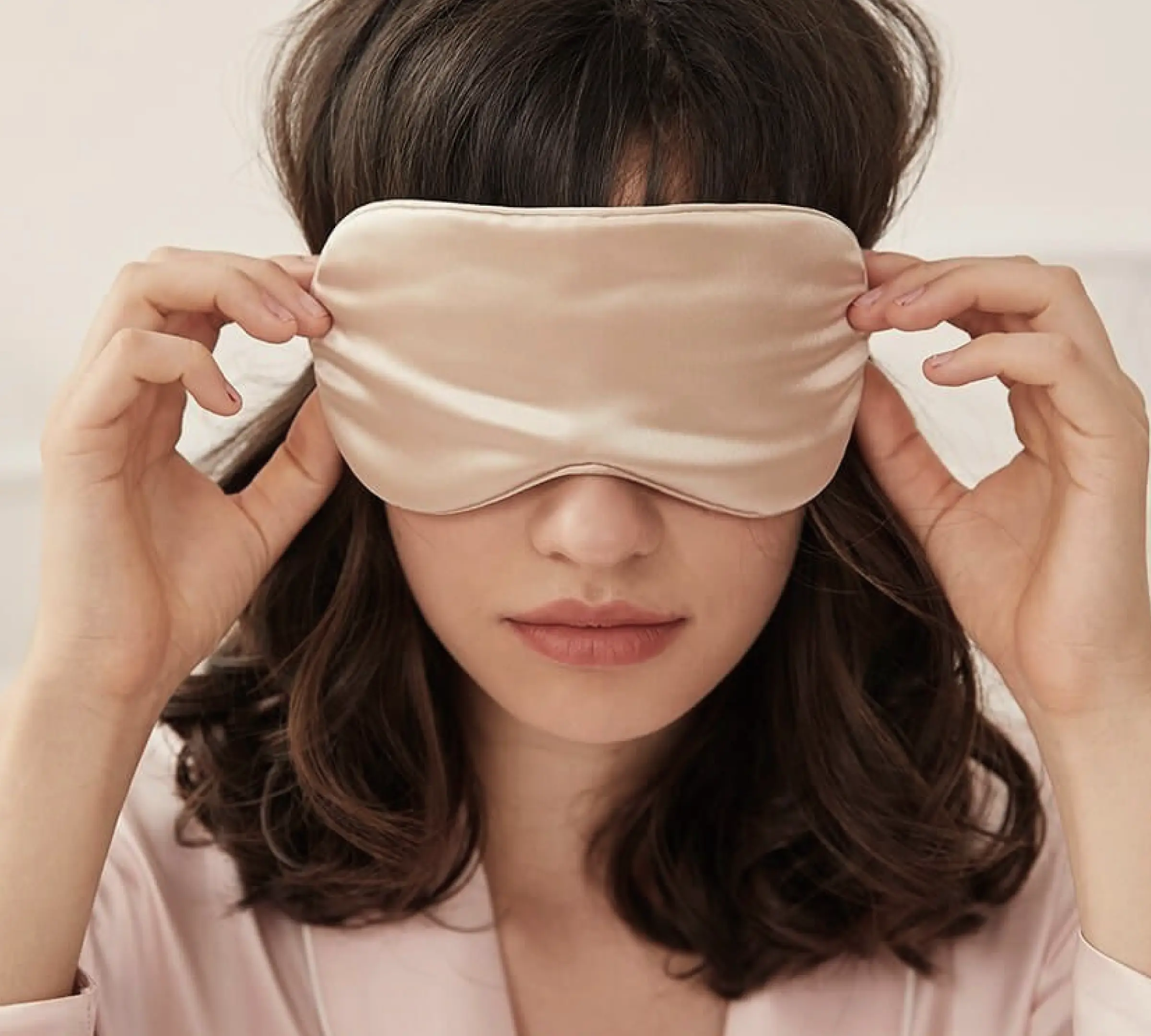
REM Ritual was built to make that system beautiful. Silk pyjamas. Aromatherapy candles. Sleep teas. Each product a tool within a nightly sequence, not a standalone purchase. The brand sat at the intersection of sleep science, sensory experience, and premium lifestyle. It was built as another Entrepreneur in Residence experiment within Deep Holistics, with physical prototypes and AI-generated lifestyle imagery used to bring the world to life before full production.
Colour as context. Everything else as constant.
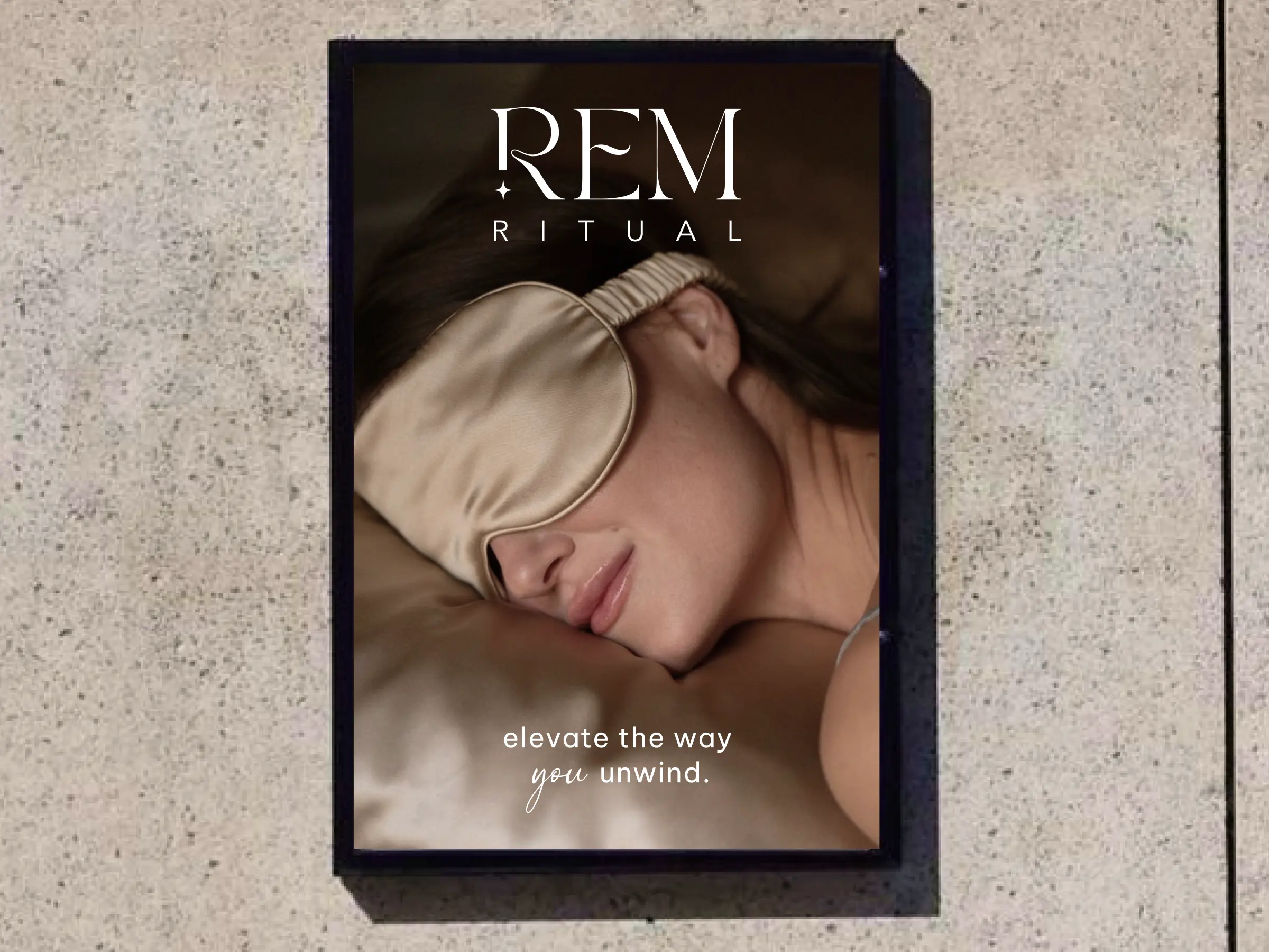
The visual identity was built on a deliberate inversion of how most brands approach colour. Instead of a fixed palette, REM Ritual uses colour as a narrative device. Each product carries its own colour identity based on what it communicates: the warmth of chamomile, the cool of eucalyptus, the deep indigo of a silk eye mask. Colour follows context. What remains constant across everything is the typographic system, the illustration style, the motifs, and the spatial language. An elegant serif paired with a minimal sans-serif. Subtle linework, celestial cues, and fluid forms. Matte and soft-touch material finishes. The backbone holds. The colour breathes.
A quiet invitation into a nightly journey.
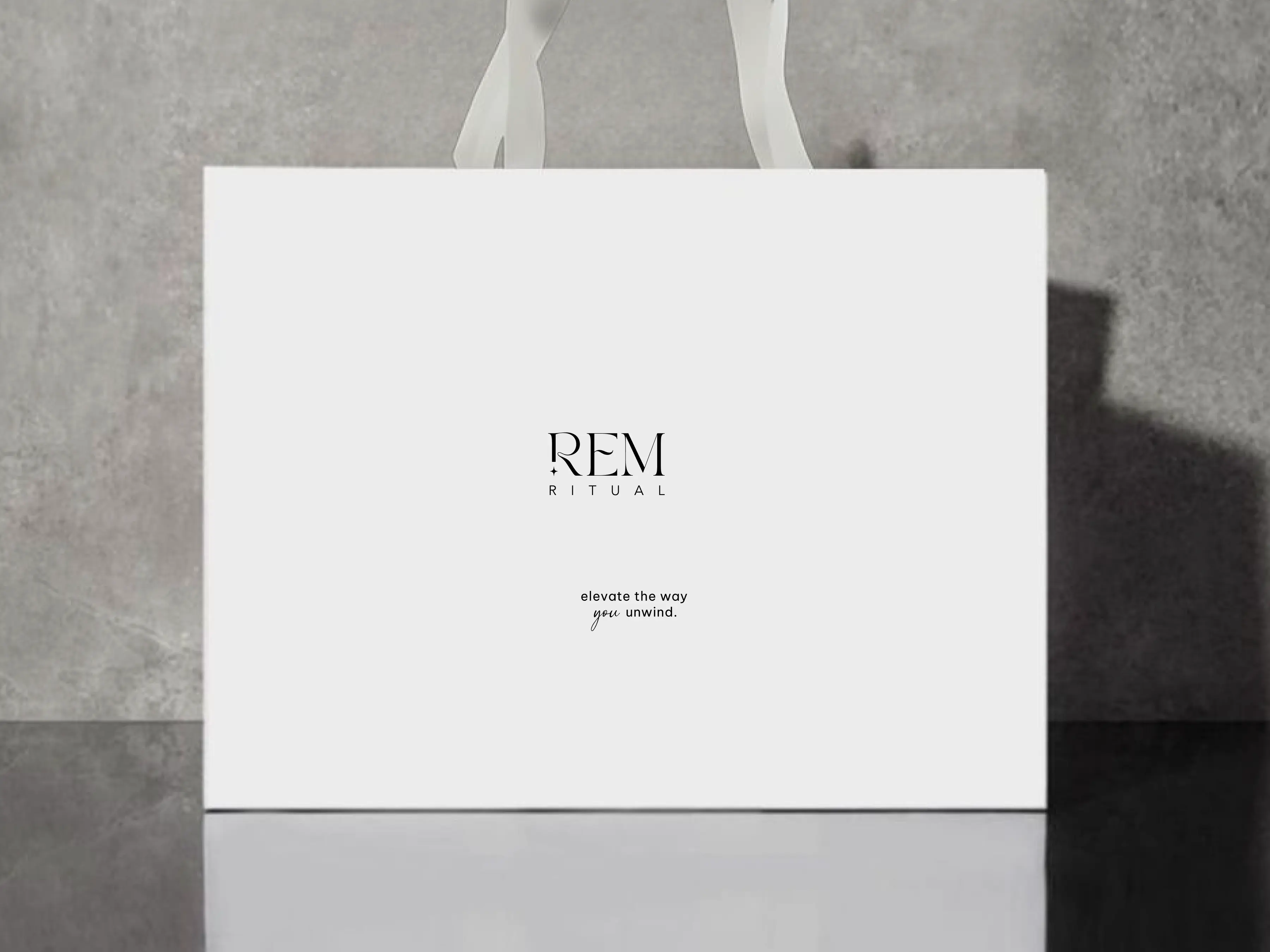
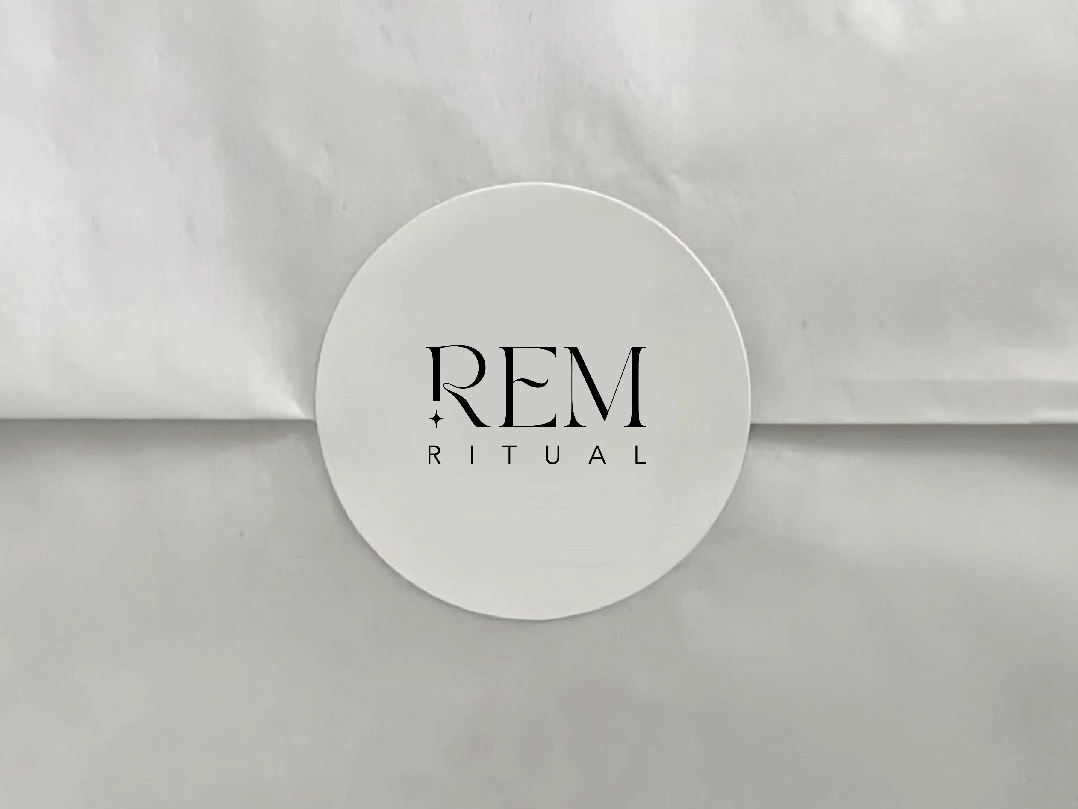
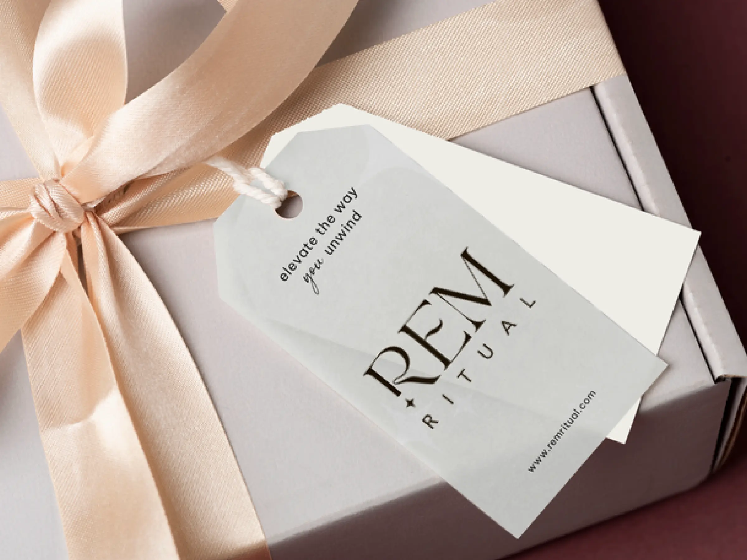
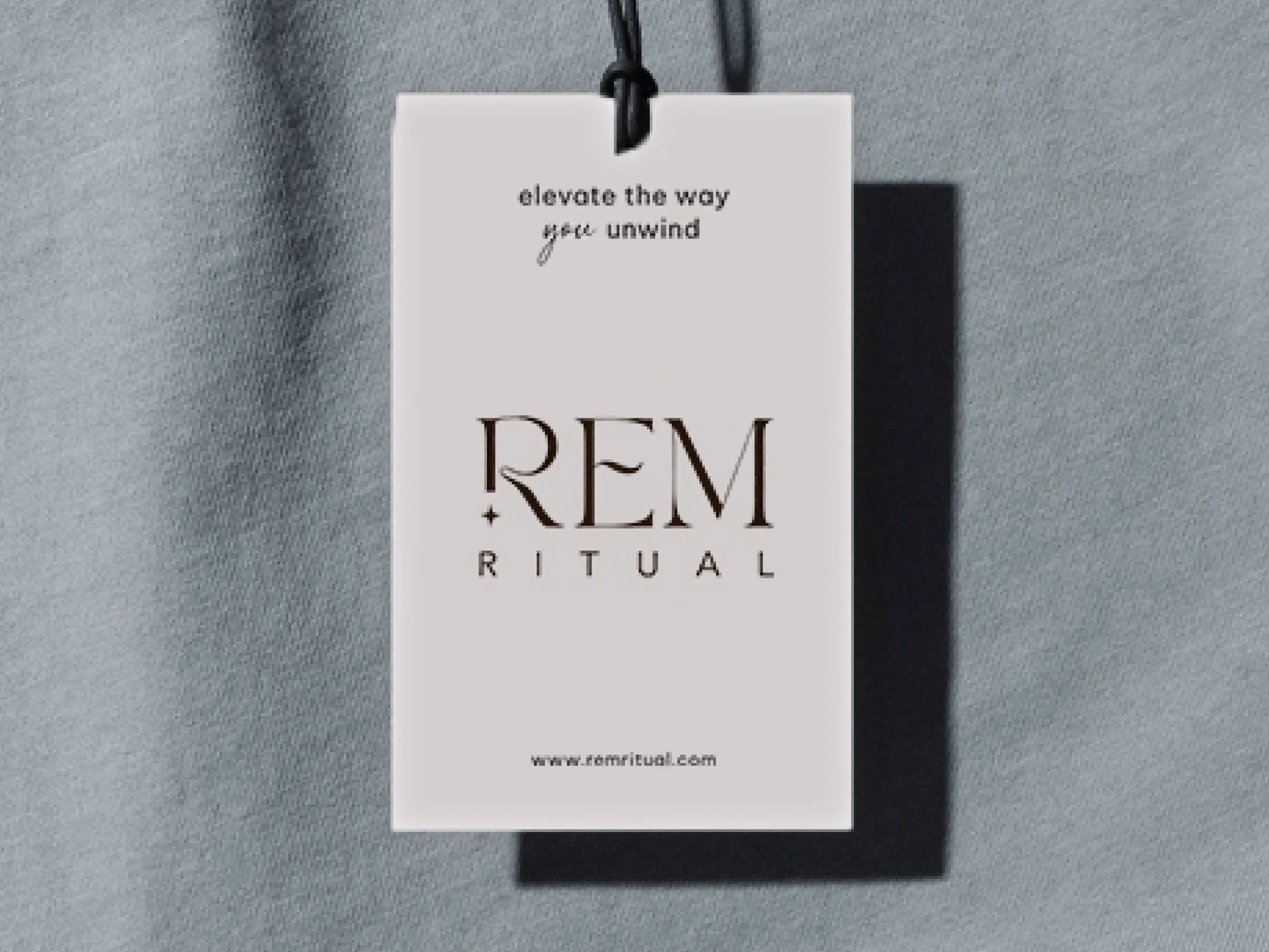
The wordmark uses a refined serif typeface with elongated letterforms. The proportions suggest breath, rhythm, and the slow pull of sleep. A star beside the R draws from the night sky, anchoring the brand in stillness and the dreamscape where REM sleep occurs. The mark is versatile enough to live on packaging, embroidered into silk, pressed into wax.
REM Ritual is a behaviour design system for sleep.
The brand is not just a product line. It is an argument about how habits form. Consistent, sensory-driven cues repeated night after night create the conditions for deeper, more restorative sleep. Every product decision, every visual decision, every line of copy was made in service of that argument. Not just what you buy. What you do with it. Not just how it looks. How it makes you feel at the moment you most need to slow down.