The problem with measuring prevention
This was the question sitting at the center of everything we were building at Deep Holistics. We could collect data across four layers of biology. We could surface patterns. We could suggest interventions. But we could not show a user the value of what they were doing until something went wrong, and the entire point was to stop something from going wrong.
The standard answer to biological age was the PhenoAge algorithm. It uses a specific set of blood biomarkers to estimate how old your body is functioning relative to your chronological age. It is scientifically grounded and widely referenced. But it is also limited. It reads only blood. It cannot see your genetics, your gut microbiome, your sleep patterns, your activity load. For a platform built on multimodal data, a single-layer aging model was not enough.
The insight that changed the framing came from the work of longevity expert Dr. Gladden and the concept of a Mosaic of Ages. The idea that biological age is not a single number but a composite of multiple system-level ages, each telling a different part of the story. Your cardiovascular system might be aging faster than your metabolic system. Your genetic risk profile might be working against gains your lifestyle is making elsewhere. A single number collapses all of that into one signal and loses most of what matters.
Our science team took that framing and built from it. Not one age. A system of ages. And not just a current state, but a trajectory. My brief to the team was simple: find a way to quantify the value of prevention before it is needed.
What we built
Getting to a representation that was both scientifically honest and humanly legible took longer than expected. The science team could model the systems. The harder problem was deciding how to show someone their own trajectory without reducing it to something meaningless or making it so complex it paralysed them. That translation, from algorithm to understanding, was the product problem I spent the most time on.
People don't act on numbers. They act on direction.
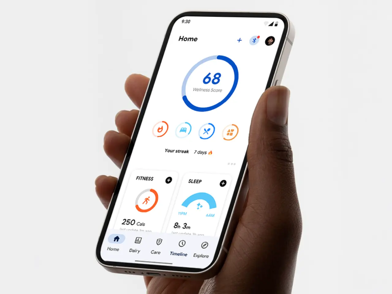
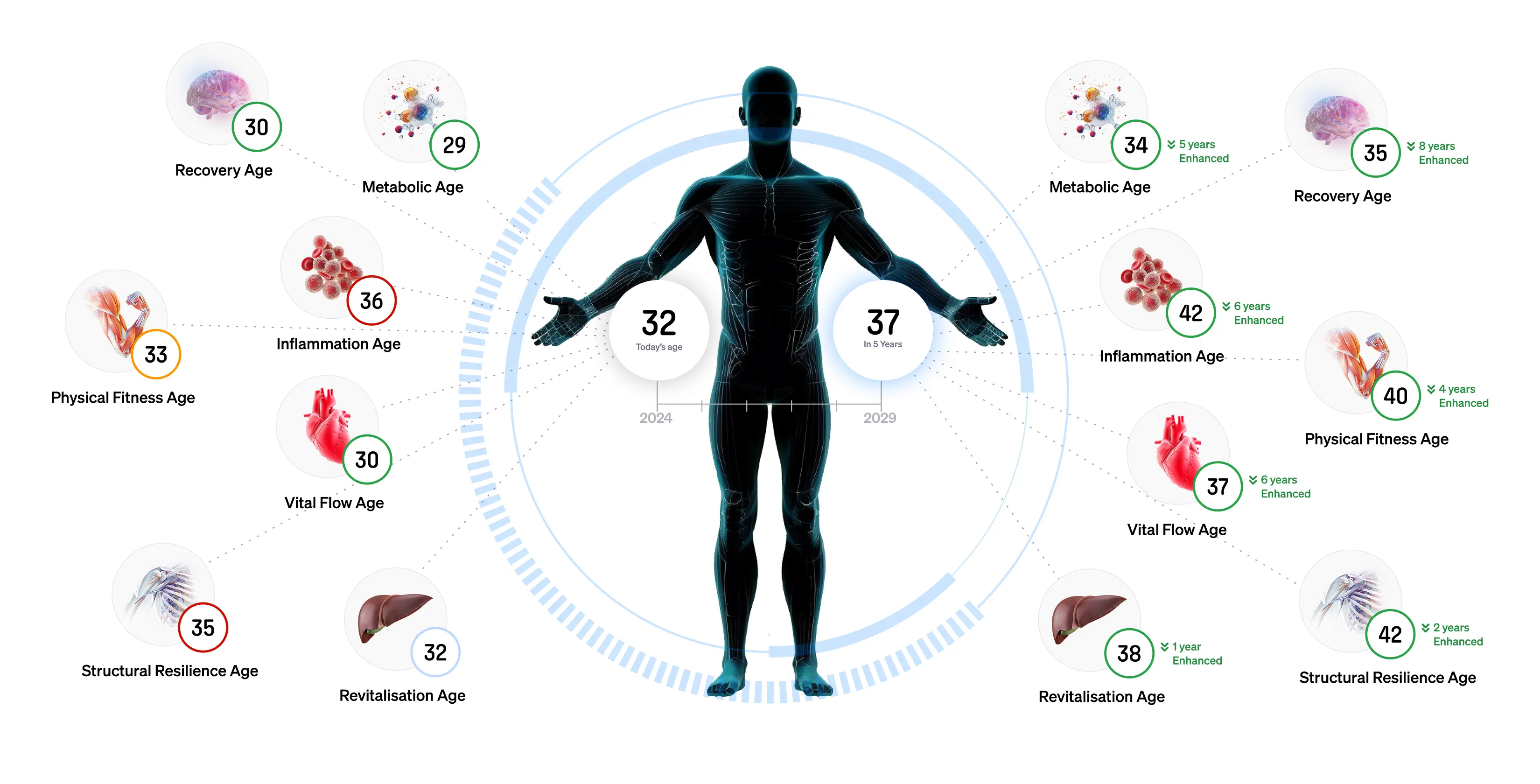
That principle shaped every decision in how we designed the output. The algorithm produced two things. First, a System Age across seven body systems. Recovery, Metabolism, Inflammation, Physical Fitness, Vital Flow, Structural Resilience, and Revitalisation. Each system drew from all four data layers. Blood biomarkers contributed the physiological state. Genetic data contributed predisposition and risk. Gut microbiome data contributed inflammatory load and metabolic function. Wearable and lifestyle data contributed behavioural patterns and recovery quality.
No single layer dominated. Each informed the others. A blood marker read differently when the gut data was already telling a story. A genetic predisposition read differently when the wearable data showed whether lifestyle was compensating for it. The System Age was the current state. A snapshot of where each system stood right now.
The second output was a Protective Index. It answered a simpler question: how much is your current lifestyle actually protecting you from what your body is predisposed to do? And how long will that protection hold? The design challenge here was specific: helping users understand that a strong Protective Index was not a reason to stop. It was evidence that what they were doing was working. A reason to continue with more conviction.
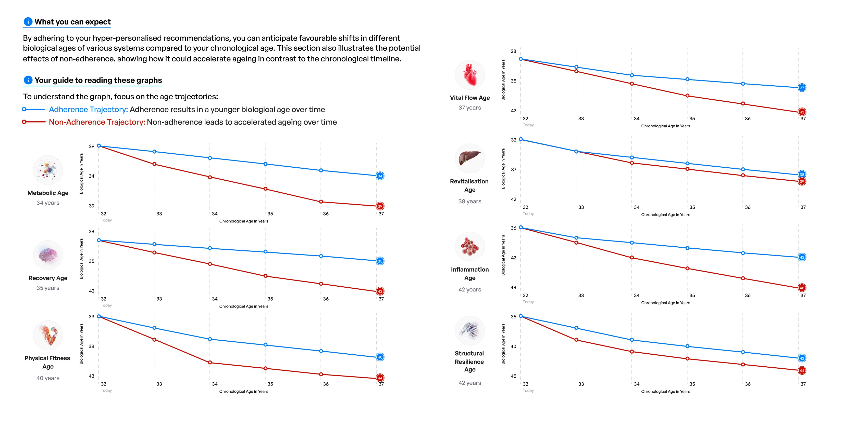
The product representation I designed brought both outputs together as a five-year projection graph, plotted against chronological age. Three curves. The first showed the aging trajectory with their current lifestyle. The second showed the trajectory with no interventions at all. The third showed the projected trajectory if they followed the platform's recommendations. The gap between the first and third curves was the value of the platform made visible.
This lived in the Human Token book as a full spread. Numbers and graph together. Coordinating with the science team to understand the algorithm well enough to represent it accurately, while keeping it legible in sixty seconds, was the hardest design brief I have written for myself.
What it showed people about themselves
One of the early users was already living an exceptionally healthy life. Strong sleep, consistent training, deliberate nutrition. When he saw his aging curves, the response was immediate. The trajectory confirmed what he had built. The curves were positive. The interventions were working.
Then he looked at the Structural Resilience system age.
It was the one system where his lifestyle was not enough. The algorithm had surfaced genetic risk factors working specifically against his structural resilience, predispositions his training was partially offsetting but not eliminating. He recognised them immediately. His parents had experienced the same patterns. He had seen the signs in his family and always wondered if they applied to him. Now he had a data-grounded answer.
The response was not anxiety. It was focus. He knew which system to prioritise. He knew which interventions to weight more heavily. He had a specific, biological reason to act on certain recommendations rather than others. The trajectory had not changed. But his understanding of it had, and that understanding changed what he did next.
That is what the aging algorithm was built to do. Not to alarm. Not to reduce a person to a number. To give someone a clear, honest picture of where they were, what was driving it, and what they could do about it. Prevention quantified. A disease that never arrived, explained in advance.